
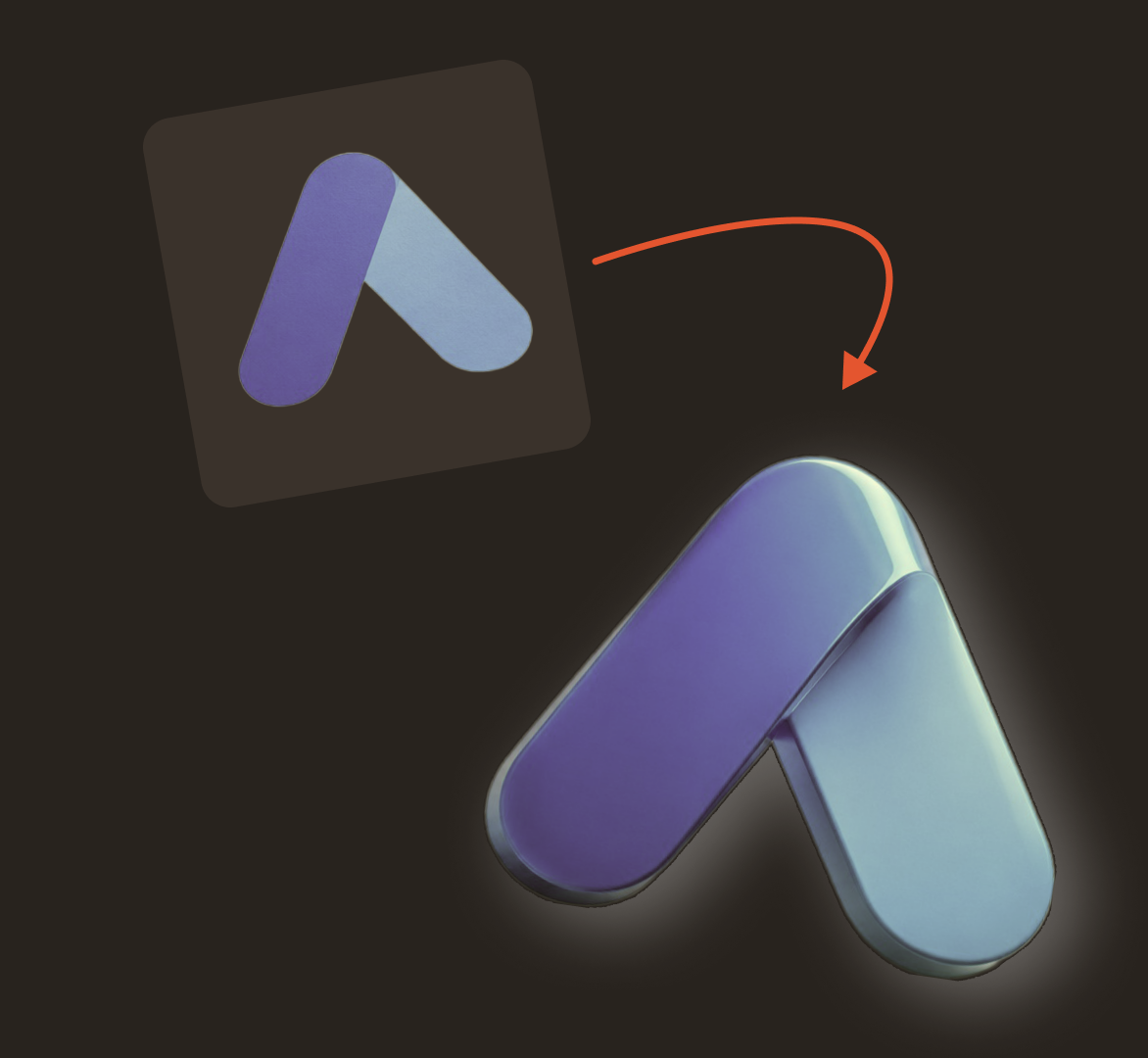
A good 3D logo starts with a shape worth recognising. Depth, lighting and materials give that shape another way to express the brand.
When I approach a dimensional logo, my first question is: what should the depth communicate? A folded surface might suggest structure and precision. Rounded lettering can feel approachable. A restrained metallic finish might suit a product with an emphasis on craftsmanship.
In this guide, I’ll explain those decisions, show how to create a 3D logo with AI and outline a manual workflow for an existing logo. You’ll also find a short tool comparison to help you choose your starting point.
What is a 3D logo?
A 3D logo is a symbol, wordmark or combination mark that appears to have depth and volume. Perspective, visible side surfaces, highlights and shadows make the design feel like a physical object.
You can create that effect in two ways:
Dimensional artwork
A logo image or vector design that uses shading and perspective to suggest depth.
A 3D model
A shape built in three-dimensional space, with geometry that can be rotated, lit and animated.
Both can produce useful brand assets. For a social graphic, dimensional artwork may be sufficient. For an interactive website logo that rotates as someone moves their cursor, you need an appropriate 3D scene.
2D vs 3D logos: what changes?
| Design element | Flat logo | 3D logo |
|---|---|---|
| Shape | Defined by its outline and internal spaces | Also influenced by depth and viewing angle |
| Colour | Usually solid colours or gradients | May include material, reflections and lighting |
| Readability | Depends on shape, contrast and typography | Also depends on highlights, shadows and perspective |
| Applications | Small icons, stationery, print and everyday branding | Campaign visuals, motion graphics and digital presentations |
| Variations | Layout and colour versions | May also need approved angles and material treatments |
I would usually keep a flat version alongside the dimensional version. That gives the identity flexibility across everyday applications.
3D logo examples: four directions to explore
The following are illustrative design directions, rather than examples of completed client projects.
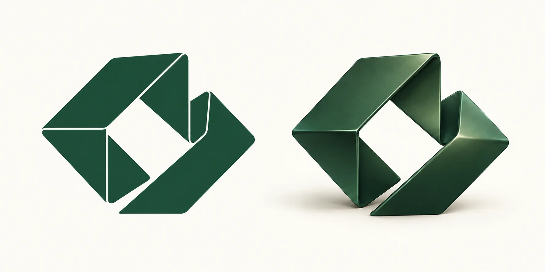
A folded geometric symbol
Imagine a modular furniture business with two interlocking planes. A slight angle reveals how the surfaces connect; different tones separate the front and side faces.
Design principle: use depth to explain the structure. Keep the connection clear when the logo is small.
Rounded, dimensional lettering
A playful creative studio could use a short wordmark with rounded letters and shallow depth. Heavy rounding can close an “e” or make adjacent letters merge.
Design principle: soften the surfaces while protecting the typography.
A brushed-metal monogram
A specialist audio brand might use a compact monogram with a satin metallic finish. Broad highlights reveal the shape without turning every surface into a bright reflection.
Design principle: let the material support the brand’s character while keeping the initials legible.
A translucent abstract mark
A digital product could use a translucent symbol as a large website visual. A glass-like logo may be clear against dark blue and almost disappear against white.
Design principle: approve the logo and its background together.
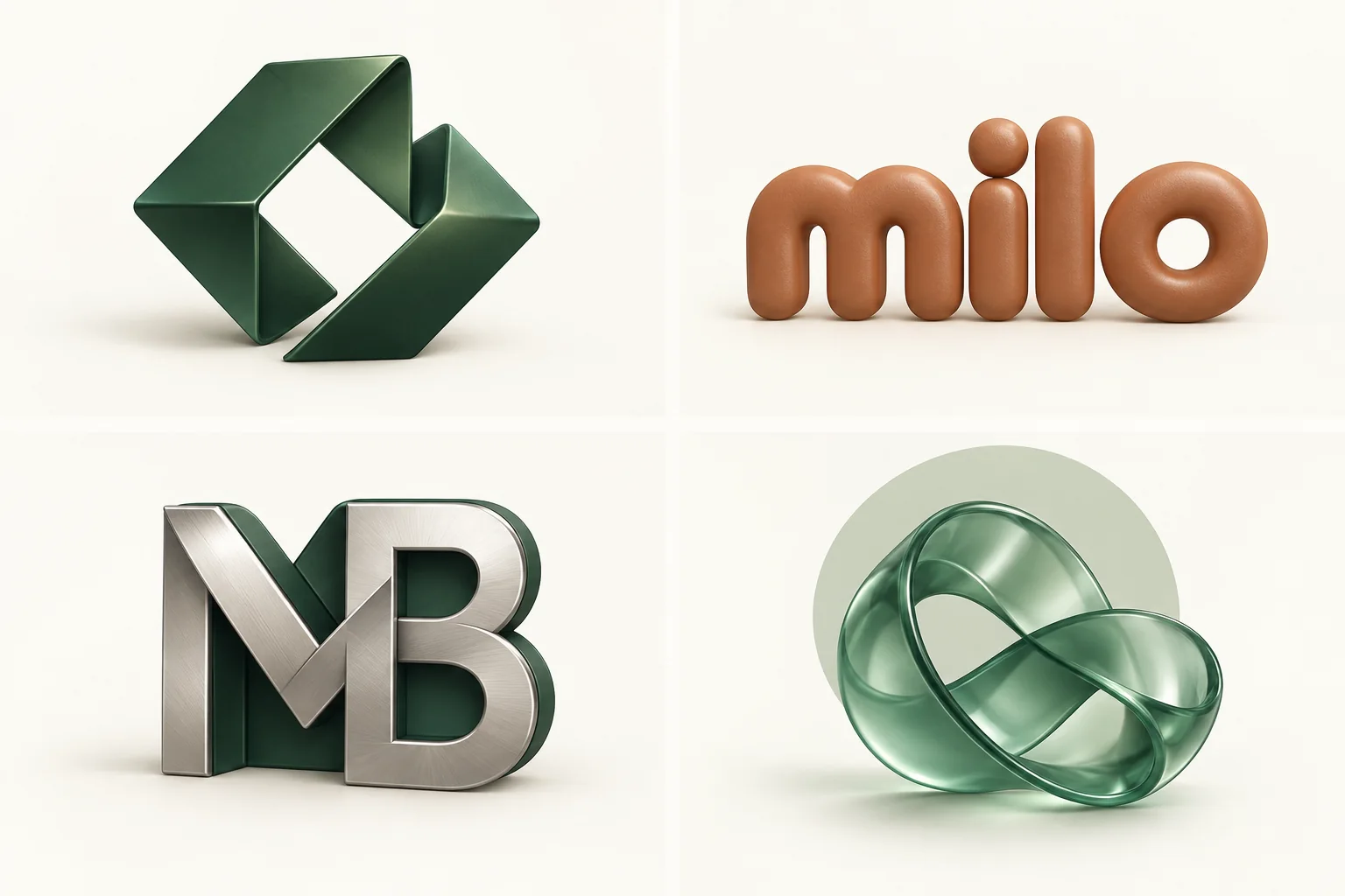
When studying references, look at the silhouette, spacing and structure before focusing on the finish. Use the four studies above to compare how each treatment changes the character of a logo.
Before you create a 3D logo, write a small design brief
Opening a logo generator is easier when you know what you are trying to communicate. I would begin with five questions:
- What does the business do?
- Who needs to recognise and trust it?
- Which three characteristics should the identity express?
- Where will the dimensional logo be used?
- Are you creating a new identity or adapting an approved logo?
A new identity gives you room to explore. An established logo needs careful preservation of its proportions and distinctive details.
Our studio exercise · Fictional brand
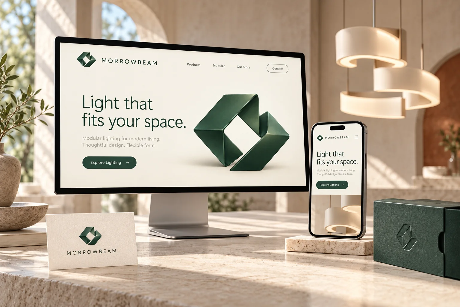
Morrowbeam
A modular lighting studio for interior designers and design-conscious homeowners.
- Character
- Precise, warm and adaptable
- Concept
- Two forms connecting around a visible central opening
- Main application
- A website launch graphic
- Supporting version
- A flat symbol and readable wordmark
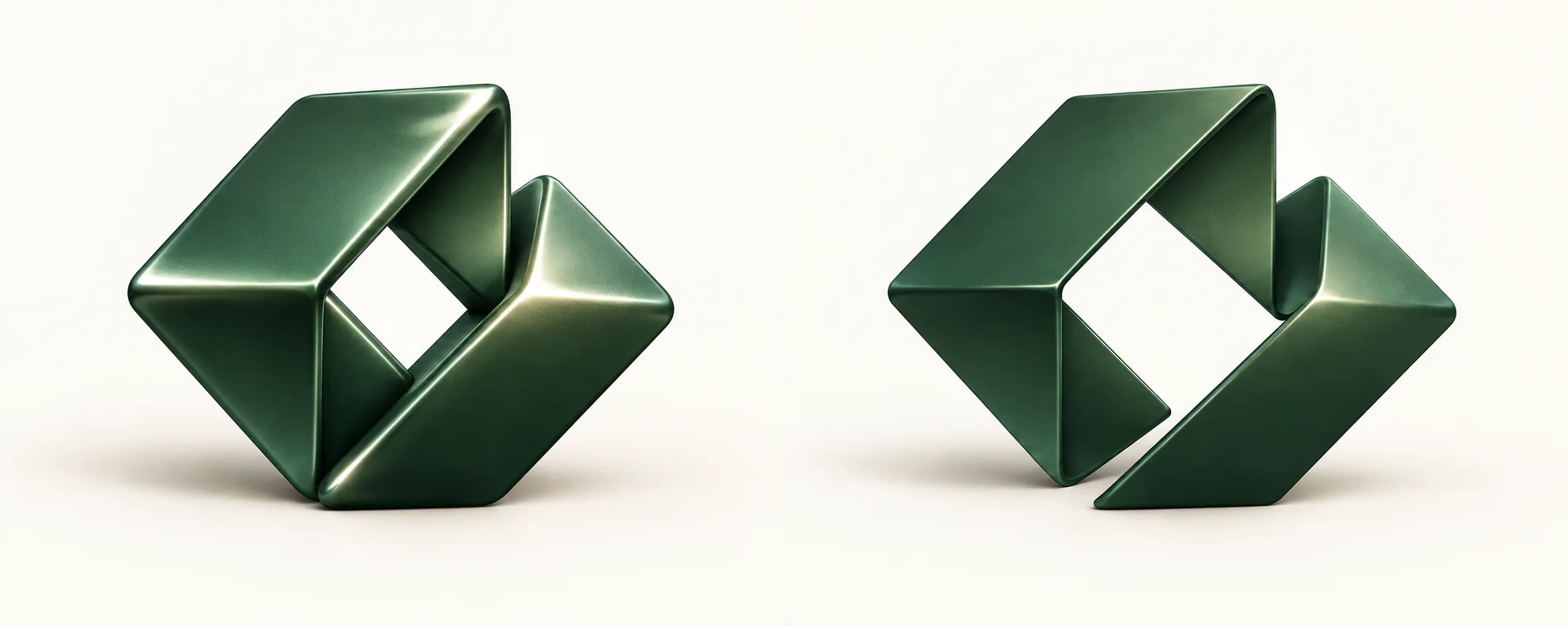
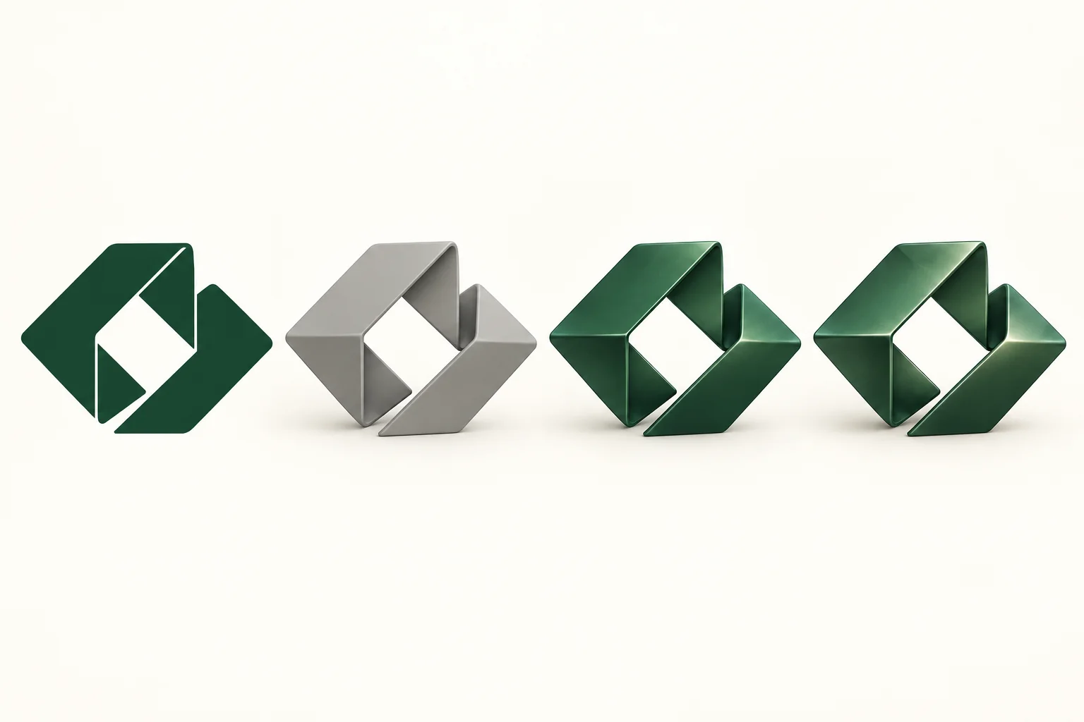
The connected forms relate to modular construction. The central opening gives the symbol a recognisable feature. Those decisions come before the material treatment.
How to create a 3D logo with AI
An AI logo maker lets you explore concepts and request visual revisions through text. Your role is to direct the result: explain the idea, choose a promising composition and refine the details.
1. Describe the concept clearly
In Design.com, start with the business name and a description of the direction. The platform supports prompt-based logo generation and AI chat-based editing.
Example starting prompt
Create a logo for “Morrowbeam”, a modular lighting studio. Explore a geometric symbol made from two connected forms with a clear opening between them. The identity should feel precise, warm and contemporary. Use restrained depth, softly lit surfaces and charcoal with warm ivory. Keep the symbol simple and the business name easy to read.
This is a starting prompt, not a guaranteed output. It gives the generator a concept, a visual character and a practical constraint. Avoid packing unrelated directions into one prompt: “luxury, futuristic, vintage, playful and minimalist” gives you little basis for evaluating the result.
2. Select the strongest shape
- Can I recognise the symbol without its lighting effects?
- Does the composition relate to the brief?
- Is there a distinctive feature worth developing?
For Morrowbeam, I would prioritise the connected forms and central opening. A dramatic reflection is easy to notice. A memorable silhouette is more useful to build an identity around.
3. Use AI chat-based editing for focused revisions
Request one meaningful change at a time. These are example instructions to try, reviewing each result before continuing.
Refine the shape
Keep the current concept and lettering. Widen the central opening so the two connected forms remain easy to distinguish.
Refine the finish
Make the depth more subtle and reduce the brightest highlight. Preserve the front-facing outline.
Refine the composition
Give the wordmark more breathing room below the symbol. Keep the current spelling and letter style.
4. Balance the symbol and typography
A dimensional symbol can appear heavier than a flat wordmark. Try reducing the symbol slightly, increasing the wordmark’s weight or adding space between the two. Judge the whole composition at its intended display size.
5. Prepare a simpler companion version
Create a flat version with the same essential outline. Compare both side by side: the connected shapes, proportions and central opening should still feel related. Use the simpler version where reflections and shadows contribute little.
6. Download and inspect the files
Design.com supports PNG, JPG, SVG, EPS and PDF downloads. Selected free logo options include vector files and commercial-use licensing; check that your chosen design is included.
- Is the background transparent where required?
- Is the business name correct?
- Is the logo clear at its intended size?
- Does the exported appearance match the approved design?
A vector file describes artwork; it is not automatically an editable 3D model. If the project requires rotation or relighting, include that requirement when choosing the workflow.
How to create a 3D logo manually
The manual route is useful when you already have an approved symbol or need direct control over depth, materials, camera and animation.
1. Prepare clean source artwork
Start with a vector master where possible. Remove stray objects, check overlapping shapes and preserve intentional openings. If the workflow requires outlined lettering, retain an editable text version for future changes.
In Blender, SVG paths can be imported as curves. Complex appearance effects may need preparation because the importer focuses on path geometry.
2. Add shallow extrusion
Extrusion gives a flat outline thickness. Begin with modest depth and inspect the shape from a slight angle. Increase it only when the side surfaces help the design. Too much depth can hide a feature behind its own side wall.
3. Add a controlled bevel
A bevel rounds or cuts the edge between surfaces. It gives light an edge to catch. An oversized bevel can change the apparent weight and shrink internal spaces. For Morrowbeam, inspect the central opening first.
4. Choose one material direction
Start with matte or satin before experimenting with chrome or glass. This makes the form easier to judge. Strong reflections can disguise awkward geometry. Explore materials once the structure works.
5. Light the shape
Begin with a broad light above and to one side. Look for a readable separation between the front, edge and side surfaces. Add fill light if darker surfaces lose important details. If metal appears almost black, inspect the lighting and reflected environment before changing the logo colour.
6. Choose a useful camera angle
Start near the front view and rotate slightly until the depth becomes visible. Keep perspective restrained for a wordmark: a dramatic angle can enlarge the first letters and compress the last ones.
7. Render and check the real placement
Place the result in the actual website layout, presentation or campaign graphic. Check the scale, surrounding space and contrast. An isolated render may look impressive yet distract from a headline.
Best 3D logo makers online: AI-powered and manual options
Choose according to whether you want to generate a new logo, add depth to existing artwork or build a scene. This shortlist also includes a desktop option for more involved production.
| Tool | Workflow | Useful for | Your main design task |
|---|---|---|---|
 Design.com | AI-powered, with manual controls | New concepts and chat-based revisions | Direct the concept and refine the composition |
 BrandCrowd | AI-assisted, with customisation tools | Logo templates and dimensional directions | Select and personalise a relevant starting point |
 3DLogo.io | Manual editor + separate AI generation | Extruding artwork or generating a model | Set depth, materials and viewing angle |
 Spline | AI-powered + manual | Interactive website graphics | Refine the scene and its behaviour |
 Blender | Primarily manual · desktop | Custom modeling, lighting and animation | Build and manage the complete scene |
Pricing reviewed 7 October 2026. Annual rates show the monthly equivalent, charged for the year; checkout offers and taxes may vary.
01 · AI-powered · logo concepts
Design.com
Overview
I use Design.com when I want to explore a logo concept and refine it through AI chat-based editing. For a 3D-style identity, I would settle the silhouette first, then request changes to the depth treatment, finish and lettering. Its professional logo resources and exclusive fonts give the concept a useful starting point.
Pros
- AI chat-based editing lets you describe focused changes to the icon and text.
- Vector and image downloads support print and digital applications.
- 50+ design tools help carry the finished identity into supporting materials.
Cons
- Free downloads apply to selected logos; check the chosen design before committing.
- A commercial-use licence does not automatically make a shared design exclusive.
Pricing
Selected free logos include vector files and commercial-use licensing. The annual checkout offer reviewed for this guide listed Starter at $5/month ($60/year), Value at $6/month ($72/year) and Premium at $7/month ($84/year). Offers and local checkout prices can differ.
02 · AI-assisted · template exploration
BrandCrowd
Overview
I would use BrandCrowd when browsing visual directions helps clarify the brief. Start with the business name and relevant keywords, then compare dimensional symbols and lettering. For this tutorial, I would judge the shape in a flat treatment before choosing a finish, and personalise the spacing and composition around the brand name.
Pros
- A broad, industry-specific template library makes it easy to compare directions.
- Customisation controls cover colour, type, spacing and layout.
- Vector and image formats help adapt the approved logo across applications.
Cons
- An unchanged template can feel familiar; a distinctive composition still needs design judgment.
- Shared template designs are not automatically exclusive to your business.
Pricing
Browsing and customisation are free, with selected free download options. Advertised Starter pricing begins at $3/month billed annually ($36/year), or $9 billed monthly. Confirm the currency, download package and offer at checkout.
03 · AI-powered + manual · artwork extrusion
3DLogo.io
Overview
If the logo already exists, I would start by uploading its artwork and developing the depth treatment. 3DLogo.io provides a direct browser workflow for extrusion, materials and viewing angles. Its separate Generate studio accepts text or images to create a model; choose the artwork route when preserving the approved outline matters most.
Pros
- Direct controls for depth, bevels, camera and material treatments.
- Exports cover still images, 3D files and motion.
- Separate AI generation offers a prompt-based starting point for models.
Cons
- Free exports carry a watermark, and higher-resolution output requires an upgrade.
- AI generation uses credits; Pro credits expire with the billing period.
Pricing
The editor has a free tier. Pro is US$8/month billed annually (US$96/year), including 9,600 Generate credits for the year. Pro removes the watermark and expands output options; taxes may be added at checkout.
04 · AI-powered + manual · interactive scenes
Spline
Overview
I would choose Spline when a logo needs to become part of an interactive website scene. AI assistance can help establish or revise the scene, while manual controls let you refine its presentation. Keep movement purposeful: a subtle response to a cursor should support recognition without competing with the page headline.
Pros
- Combines AI scene assistance with a visual 3D editor.
- Supports interactive web presentation rather than only a static image.
- Materials, lighting and scene behaviour can be developed together.
Cons
- Free web exports include a watermark, and export features vary by plan.
- Scene complexity and interactions need testing on mobile devices.
Pricing
A free plan is available. Hobby costs $12/seat/month annually ($144/year) or $15 monthly. Pro costs $25/seat/month annually ($300/year) or $30 monthly. Check AI-credit allowances and export access for the selected plan.
05 · Manual · desktop production
Blender
Overview
I would use Blender when the project needs detailed control over the logo’s geometry, lighting and animation. Start with clean vector artwork, then build the scene deliberately. For the Morrowbeam exercise, the priority would be preserving the central opening as extrusion, bevels and a material treatment are introduced.
Pros
- Detailed control over geometry, cameras, materials and animation.
- Editable project files support future scene revisions.
- Free, open-source software that can be used commercially.
Cons
- A steeper learning curve than a guided online logo maker.
- Rendering time and hardware requirements increase with scene complexity.
Pricing
Free to download and use, including commercially, with no software subscription. Optional assets, add-ons and external rendering services may cost extra. Budget for the learning and production time required to build a finished scene.
Common 3D logo mistakes—and how to fix them
| Problem | What to check | Practical fix |
|---|---|---|
| Letters merge together | Bevel width, spacing and viewing angle | Reduce the bevel or adjust spacing |
| The symbol looks bulky | Extrusion depth and perspective | Reduce depth and move closer to a front view |
| Highlights hide the design | Light intensity and material roughness | Soften the light or use a less reflective finish |
| The logo disappears on a background | Edge contrast and transparency | Adjust the background or prepare another treatment |
| An AI revision changes the concept | Whether the prompt identifies what must stay | Name the features to preserve; request one change at a time |
| The small version is unclear | Fine details, shadows and internal spaces | Use a simplified or flat version |
My final checks before approving a 3D logo
- Recognition: Does the mark relate clearly to its flat version?
- Readability: Are the name and internal openings clear?
- Consistency: Do the material, lighting and typography support the same character?
- Application: Does the design work in the actual layout?
- Delivery: Are the image, vector or scene files suitable for their use?
For this exercise, prepare a flat logo, one approved dimensional view, a transparent image and the editable source available from the chosen workflow.
Frequently asked questions
Can I create a 3D logo with AI?
Yes. Use AI to explore dimensional artwork and request changes through prompts. Some tools also generate models. Choose based on whether you need an image, vector artwork or an editable scene.
Do I need to learn 3D modeling?
You can create dimensional artwork without learning modeling. A manual workflow is useful for precise scene control, custom animation or reproducing an existing outline as geometry.
Can I turn an existing logo into a 3D logo?
Yes. Begin with clean artwork and preserve its distinctive proportions. Add depth gradually and check that bevels, lighting and perspective do not obscure important details.
Should my 3D logo replace my flat logo?
I would normally keep both. The dimensional treatment supports campaigns and digital experiences; the flat version handles small placements and simpler reproduction.
What file format should I download?
Use an appropriate image format such as transparent PNG for a still. Keep vector artwork for scalable flat applications. Retain the native project and required model exports for further 3D editing.
Keep developing your design eye.
Explore the principles behind the work and collect references for your next concept.