I don’t judge an AI logo generator by how many pictures it produces. I judge it by what happens after I see the first promising idea. Can I steer it toward the actual brand? Can I improve one element without losing the rest? And could I confidently hand the finished files to a client?
Those questions shaped how I tested these AI logo generators. Each one can start from a written prompt, and several also start from professionally designed templates. What separates them is whether you can keep art-directing after the first result, on a logo that stays editable. So I gave all nine the same brief and followed each one from prompt to revision to export, screen by screen. If budget is your first filter, read our free vs paid logo makers comparison alongside this one. For logo makers beyond AI-first tools, see our best logo makers of 2026.
Each of the nine tools has different strengths. Some are better for typography, some for free vector downloads, and some are strongest when I want to explore ideas rather than deliver a finished mark. This comparison weighs those differences instead of pretending that every AI generator works in the same way.
Disclosure: DesignExpert.ai has no commercial relationship with any of these AI logo generator tools. There are no affiliate links, and no tool saw or approved this review.
01 / Compare
Which AI logo generator is best for your workflow?
A useful comparison should distinguish text-to-logo generation, guided or template-based creation, and AI-assisted editing. Those are different capabilities. The table below emphasizes what you can actually control.
| Tool | AI creation approach | Best fit | Key limitation |
|---|---|---|---|
 Design.com | Prompt + curated concepts + AI chat revisions | Refining a logo after the first draft | Check licensing and actual exported paths |
 BrandCrowd | Prompt/keywords + structured editable designs | Exploring many polished directions | Shared design similarity / paid packages |
 Kittl | Text prompt + powerful visual editor | Lettering and controlled revisions | One concept per turn; credits |
 Wix / Wixel | Prompt + AI agent + component editing | Four distinct directions per prompt | Tight credits; SVG needs vectorizing |
 Namecheap | Guided AI from choices, not free-form chat | Free guided business logo | No AI revisions; sign-in to download |
 Canva AI | Text prompt + regenerate + content editor | Marketing assets and brand application | Proofread; SVG is a Pro feature |
 Adobe Express | Text prompt + generative image + editor | Concept imagery inside Adobe layouts | Spelling, banned motifs; raster output |
 Ideogram | Prompt-led image/typography exploration | Wordmarks and lettering | Proofread + inspect paths |
 Dreamina | Prompt + references + image editing | Mood boards and material studies | Raster; free downloads watermarked |
What happened when each tool got the same brief
Observed results from the Alder & Ash test. “Partly” means the request was only partly met; details and screenshots are in each review.
| Tool | Input method | First pass | Name spelled right | Respected “avoid” list | AI revision | Files seen without paying | Cost / access observed |
|---|---|---|---|---|---|---|---|
| Design.com | Free-text prompt (name + keywords auto-extracted) | 6 AI logos + template grid | Yes Correct in every AI logo (one early run carried over a previous session’s name; a re-submit fixed it) | Yes In the AI set: no houses, leaves, gradients or badges (two illustrations showed tiny candle flames). House icons appeared only in the template suggestions below it | Partly 2 of 3 chat edits did exactly what was asked and kept the wordmark. 1 changed spacing only, though the chat said it matched the serif | Fully editable logo: live text, recolourable mark. Download goes to checkout | Free AI chat edits capped. Checkout: $3 / $4 / $5 per month, billed annually |
| BrandCrowd | Description box → name + keywords | Large grid (filterable) | Yes | Yes With the Wordmark style filter on: text-led, on-palette lockups. The unfiltered grid leaned on house icons | Partly Added a matching serif AA, but moved “ESTD 2026” instead of removing it | Account needed to edit. Download goes to checkout | Same $3 / $4 / $5 tiers as Design.com |
| Kittl | Creative Agent chat (full brief) | 1 per turn | Yes | Yes Serif wordmark, charcoal, no icons | Yes Kept wordmark untouched, added weight-matched AA (one small curl artifact) | PNG 1024 px. Vectorize → SVG with 2 flat colours (in-app) | Free plan. Credit cost not shown in Agent. Workflows show 22 credits |
| Wix / Wixel | Chat prompt | 4 named directions | Yes | Yes Stone/oak/charcoal, no banned motifs | Partly Strokes went thinner than the wordmark. Texture stayed, and Wixel said it couldn’t confirm | PNG by default. “Vectorize your logo to enable SVG export” | 22 of 30 free credits (16 + 6) |
| Namecheap | Guided quiz: fonts, palette, 3 icons (no prompt) | Large grid | Yes | Partly Restrained serif + thin geometric icons. One neon-green-on-mauve result | n/a AI revision. Manual editor, one-click one-colour palette | Download / save requires sign-up or log-in | Free; account to download |
| Canva AI | Generate image dialog, “Vector” style | 1 | No “AIDER & ASH”, with a line struck through the letters | Partly Palette on brief, but added architectural frame lines | Yes Second prompt fixed spelling and removed frame | Raster in editor (1264 px). JPG/PNG/PDF free. SVG + transparent BG are Pro | Free account; Pro upsell on several tools |
| Adobe Express | Prompt box → Generate image (Firefly Image 4) | 4 images | Partly 2 of 4 correct; others read “ALIERRA” and “ALDIR& ASH”, plus gibberish taglines | No Leaves, trees and a house in 3 of 4; painterly textures | Yes Remove object cleanly erased the leaves and gibberish text (one tiny stray mark) | Raster image on a page layout. No vector logo seen | Free daily generations; some tools (Erase) premium |
| Ideogram | Free-text prompt | 4 | Yes All four | Yes It also added a tagline lifted from the brief | Yes Precise Edit added a thin AA and kept the type identical | Raster image. Separate Vectorize / Generate Vector apps | 18 of 30 free credits (12 + 6) |
| Dreamina | Free-text prompt (Seedream 4.6) | 4 | Yes | No Stone/oak textures, drop shadows, faint “AI” mark in corner | Partly Smart edit flattened it, but mid-grey not charcoal; ghost texture left | Raster only. Watermark removal is a paid feature | 14 credits. Seedream 5.0 Pro / 2K paywalled |
The first table is an editorial fit comparison; the second records what was observed in one run per tool. Neither is a numerical score. Access, credits, files and license terms can change; verify the selected plan.
02 / One design brief for all nine
The brand brief every tool received
A fair comparison starts with the same challenge. Alder & Ash is fictional, and the brief is deliberately hard to satisfy with a stock category icon: the obvious motifs (houses, leaves, flames) are ruled out, and the mark has to survive in one colour.
Brand study / Alder & Ash · Used in this test
Alder & Ash
Premium, minimalist home and lifestyle brand · ceramics, linens, candles
- Feeling
- Calm · crafted · quietly premium
- Direction
- Refined typographic wordmark or a simple abstract monogram
- Palette
- Charcoal · warm stone · soft oak
- Avoid
- Leaves, trees, flames, houses, gradients, ornate badges
The prompt every tool received
Logo for "Alder & Ash", a premium, minimalist home and lifestyle brand selling considered objects for the home: ceramics, linens and candles. It should feel calm, crafted and quietly premium. Explore a refined typographic wordmark or a simple abstract monogram. Muted palette: charcoal, warm stone, soft oak. Avoid leaves, trees, flames, houses, gradients and ornate badges. Must work in one color and at small sizes.
Tools with a free-text box got this exact prompt (Kittl’s agent began “Design a logo for…”). Namecheap has no prompt, so the brief was translated into its font, palette and icon choices. Each tool then got one focused revision request where AI editing was available.
What was scored after generation
Does it respect the avoid list?
Is the brand name accurate and legible?
Can a follow-up prompt improve one detail without breaking the rest?
What files can you actually get, and at what cost?
03 / The detailed reviews
Nine AI logo makers, from a brand designer’s perspective
Each review starts with real screenshots from the Alder & Ash run. Then come three clearly labelled layers: Observed in testing (what the tool actually did), Wajiha’s earlier view (her opinion as published before testing) and Designer’s read after testing. No stock images, vendor demos or simulated screens are used.
Tool 01 / Hands-on test
Design.com
Most control after the first draft · prompt + templates + AI chat edits on an editable logo
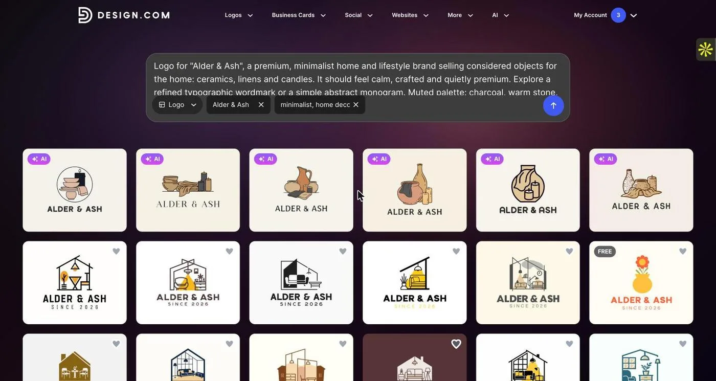
The same brief on Design.com. The top row (marked AI) is generated from the prompt and stays on brief: no houses, leaves or gradients, and the name is spelled correctly. The rows underneath are template suggestions, which did include house icons.
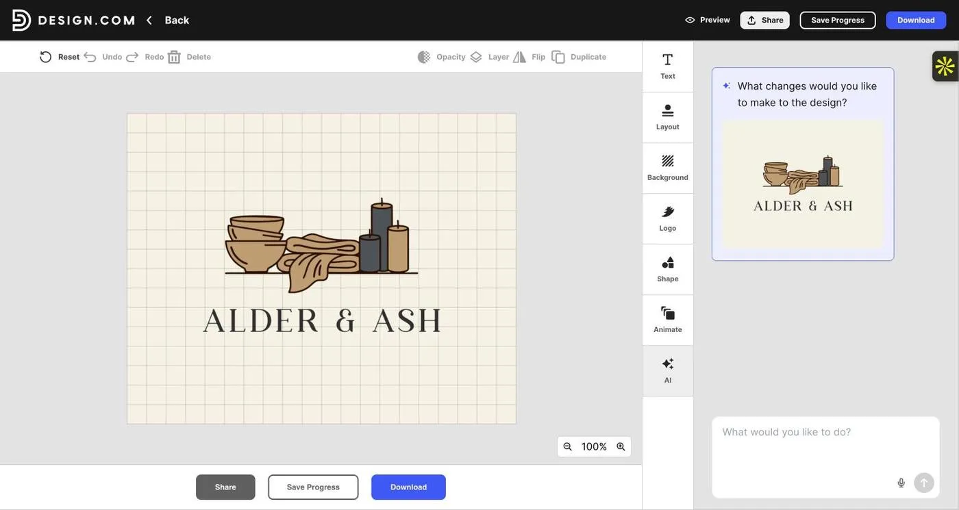
Starting point: an AI logo with a light serif wordmark and a bowls, linen and candles illustration. It’s too literal for a logo, but the type is worth keeping.
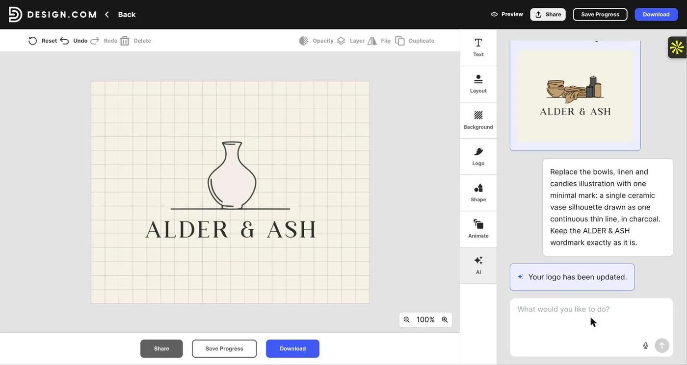
AI chat edit: “replace the illustration with a single ceramic vase drawn as one continuous thin line, in charcoal. Keep the wordmark exactly as it is.” The illustration was swapped and the wordmark left untouched.
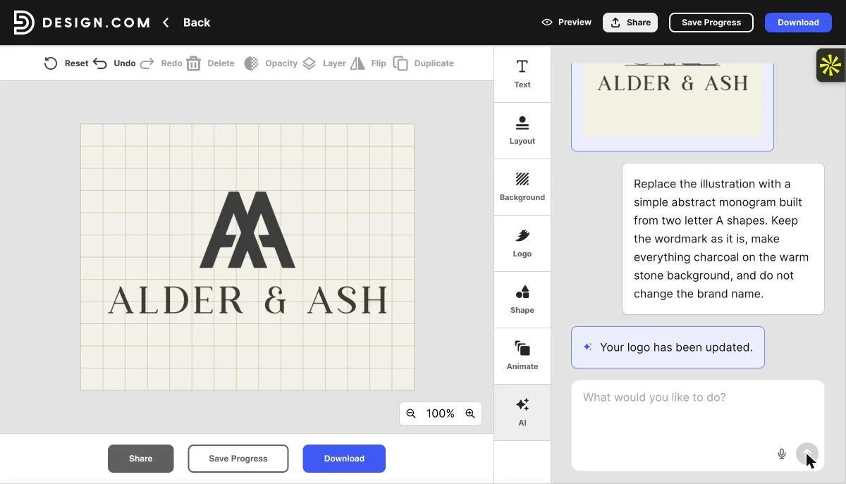
A different direction from the first session: “replace the illustration with a simple abstract monogram built from two letter A shapes.” Done in about 25 seconds, again without touching the wordmark.
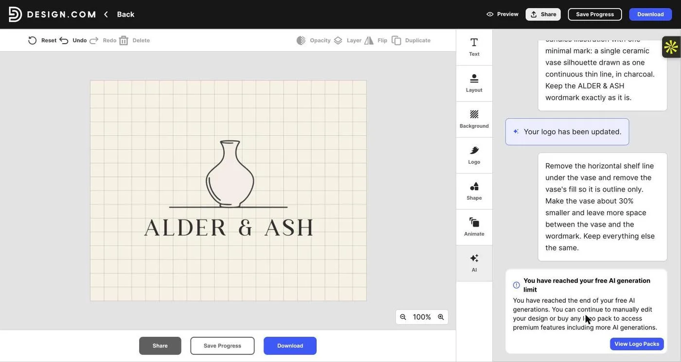
The next chat request hit the free tier’s cap: “You have reached your free AI generation limit.” Manual editing stays free.
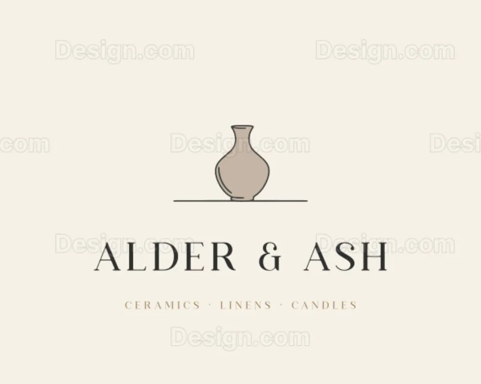
Finished by hand in the same editor: vase recoloured warm stone, resized for breathing room, and a tagline added in soft oak with wide letter spacing. Shown in Design.com’s watermarked preview.
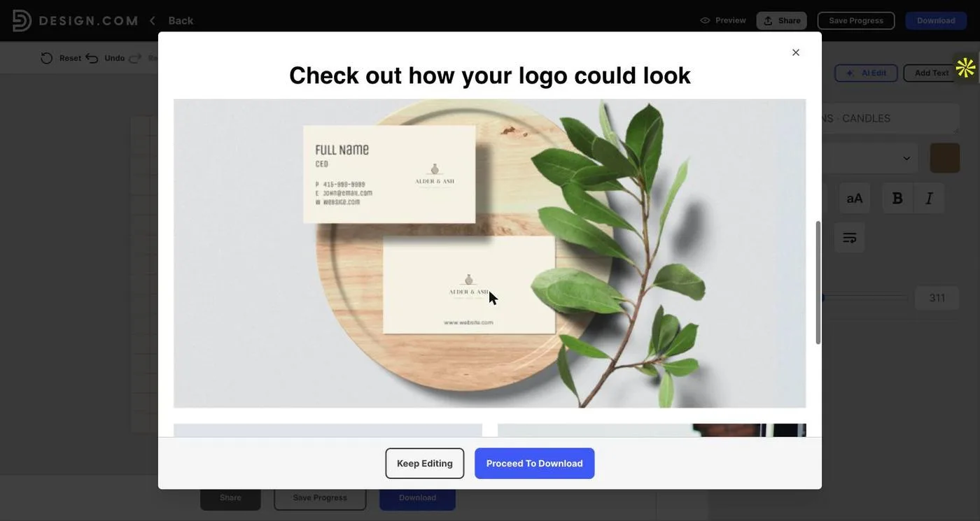
The preview places the logo on mock-ups such as business cards, which is a quick check of how it holds up at small sizes.
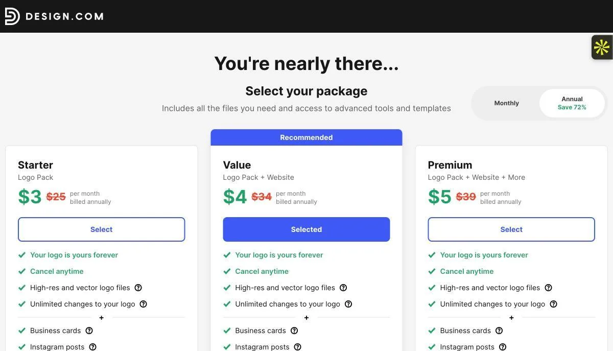
Download opens package selection; the paid packs list high-res and vector files. Nothing was bought.
Observed in testing
- The brief became a name chip plus the keywords “minimalist, home decor”. All six AI logos spelled “Alder & Ash” correctly and avoided houses, leaves, gradients and badges (two candle drawings had a tiny wick flame). In the first session, one run printed a name left over from an earlier session; re-submitting fixed it.
- The AI logos were literal (small ceramics, linen and candle illustrations), but the palette and the light serif wordmarks fitted the brief. The template suggestions below the AI row leaned on house icons.
- Across two sessions, three AI chat edits were made. Two did exactly what was asked and left the wordmark untouched (vase swap, AA monogram). One (thinner monogram strokes) changed only the spacing, while the chat reply said it had matched the serif.
- Everything stayed editable after the AI edits: the wordmark is live text (Jackson BC, size and letter spacing adjustable), the mark can be recoloured from a suggested palette, and elements resize and move freely.
- The free account’s AI chat edits are capped. After the limit, manual editing, preview and saving still worked; more AI edits require a logo pack.
- Download led to checkout: Starter $3, Value $4, Premium $5 per month, billed annually (shown struck through from $25 / $34 / $39).
Wajiha’s earlier view (before testing)
“Design.com is the tool I reach for in a brand-focused workflow. Two ways to start a design and the ability to refine it with a prompt give me the most useful combination of speed and art direction.”
Designer’s read after testing
What I value in Design.com isn’t the first draft. In this test its first drafts were more literal than Kittl’s or Ideogram’s. What I value is what happens next. The AI result arrives as a logo, not a picture: the type is live, the mark is a separate element, and the colours are swatches. So I can do what a designer does after a first draft. I keep the strong part (the light serif wordmark), replace the weak part (the illustration) with a sentence, then finish the details by hand without anything degrading.
That’s the difference the walkthrough above shows. Two of the three chat edits changed exactly one element and left everything else alone, which is the hardest thing to get from image-based tools. When the free AI edits ran out, I could still finish the logo in the same editor: recolour, resize, add a tagline. The result is calm, on-palette and legible, and it took minutes.
It has limits. You need to check every AI edit against the screen rather than the chat reply. The free tier caps AI edits, and clean high-res and vector files come with a paid pack. Kittl and Ideogram are stronger if you only want a beautiful first image. Design.com suits you if you want to keep shaping a logo after the first image, and that’s how I work.
Where it works best
Founders and designers who want to keep directing a logo after the first draft, in plain language and by hand, on a file that stays editable.
What I’d check before handing it over
Compare the before and after of every AI edit, and plan for the free AI edit cap. Confirm which package includes the vector files and licence you need.
Tool 02 / Hands-on test
BrandCrowd
Best for browsing many directions · same editor as Design.com
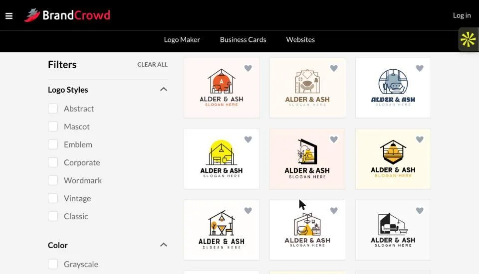
Default results for the same brief: mostly house and interior icons with a “SLOGAN HERE” placeholder.
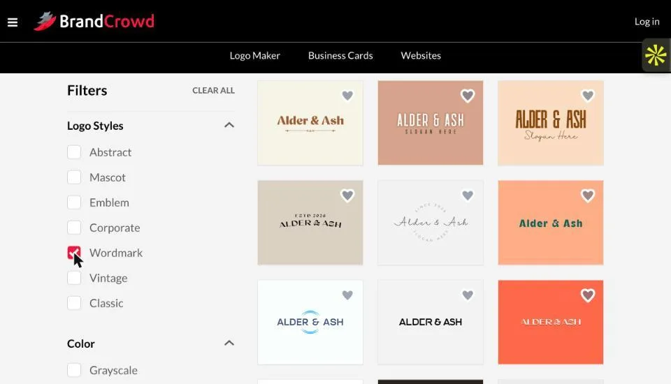
Switching on the Wordmark style filter gave text-led lockups that are much closer to the brief.
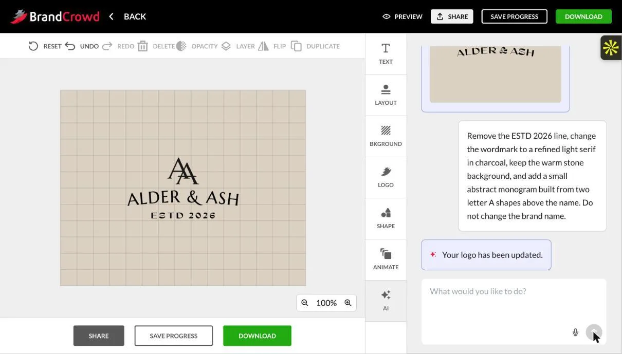
AI chat revision: remove “ESTD 2026”, use a light serif in charcoal, keep the stone background and add an AA monogram. The monogram matched, but “ESTD 2026” moved below instead of disappearing.
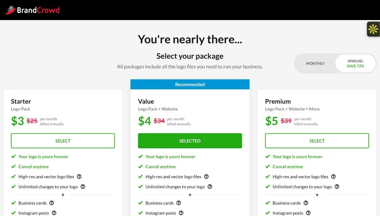
Download led to the same three-tier checkout seen on Design.com. Not purchased.
Observed in testing
- The brief was parsed into Business Name “Alder & Ash” and Keywords “minimalist, home decor”, the same extraction Design.com used.
- The default grid ignored “avoid houses”: nearly every result had a house or interior icon. The Wordmark filter produced much better results (it only applied after being toggled off and on).
- Opening a logo to edit brought up a “Start Editing” wall (email, Google or Facebook). After signing in, the editor and AI chat panel were identical to Design.com’s.
- The revision added a thin serif AA monogram in charcoal and kept the stone background. It moved the “ESTD 2026” line rather than removing it.
- Checkout showed the same $3 / $4 / $5 per month (billed annually) packages.
Wajiha’s earlier view (before testing)
“BrandCrowd is a strong alternative when I want to see many different answers to the same brief. It stays compelling for template-led exploration, editable typography and practical export formats.”
Designer’s read after testing
In practice BrandCrowd is Design.com with a different front door: same keyword parsing, same editor, same AI chat, same pricing. The difference is volume. You get a much bigger grid and filters to narrow it, which suits the “show me many directions” stage.
Without filters, the grid leans on category clichés. The house icons are exactly what the brief ruled out. The style filters matter more here than the prompt does.
Where it works best
Early exploration, client mood-boarding and founders who want lots of options before choosing a direction.
What I’d check before handing it over
Use the style filters before judging the tool. Read every AI edit closely, because partial compliance is easy to miss on a small canvas.
Tool 03 / Hands-on test
Kittl
Best brief-following in this test · editable vector after one click
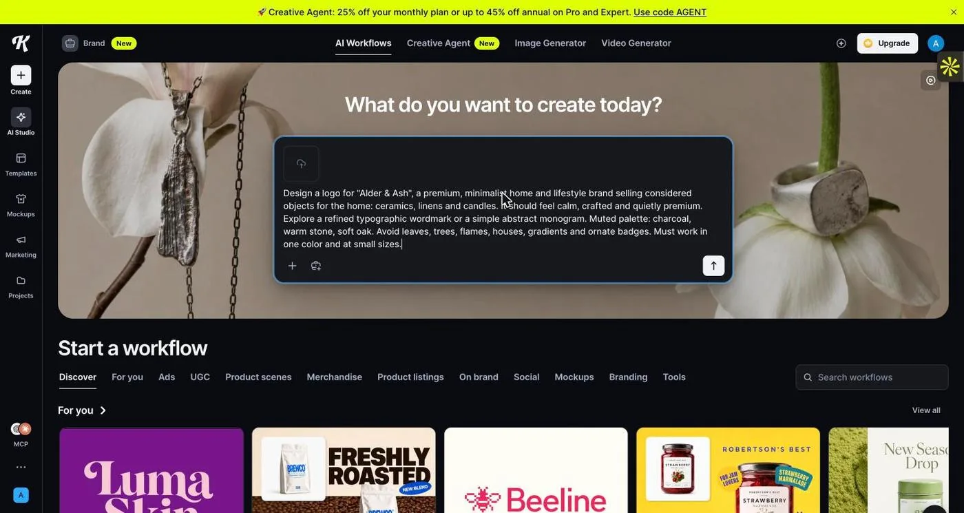
The same brief entered into Kittl’s Creative Agent. Kittl also offers template-style logo workflows; this test used the open prompt for consistency.
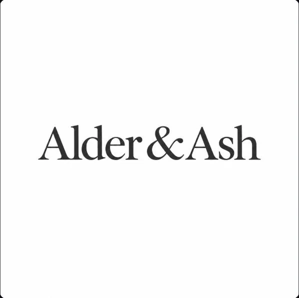
First result (zoomed): a serif wordmark with a custom ampersand, charcoal on white. Correct spelling, no icons.
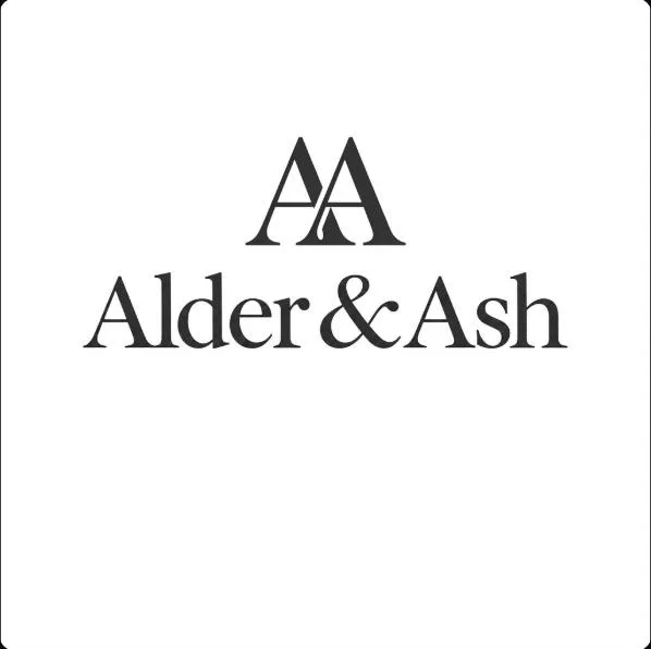
Revision: “keep this wordmark exactly, add a simple abstract AA monogram above it, same stroke weight.” The wordmark was preserved and the AA matched its weight.
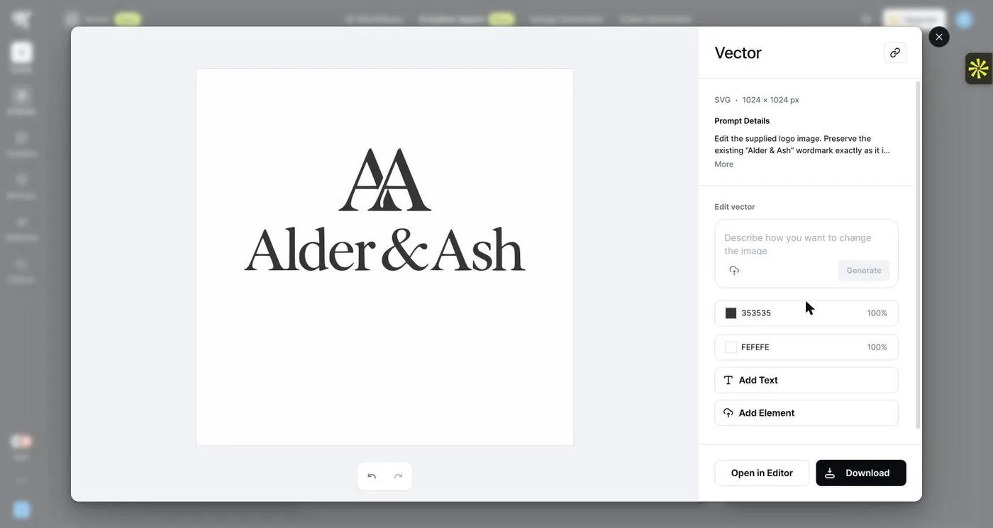
Vectorize turned the PNG into an SVG in seconds. The colour list shows only #353535 and #FEFEFE.
Observed in testing
- The Creative Agent showed “Choosing the model and settings…” and then returned one image, with a short rationale and suggested next steps (abstract monogram, refine the ampersand, one-colour version, packaging mock-up).
- The first result was a restrained serif wordmark with a custom ampersand: correct spelling, charcoal, no banned motifs.
- For the revision, the agent rewrote the request into a detailed edit prompt (visible under Prompt Details) and ran it on Nano Banana 2.1. The wordmark stayed identical. The new AA has one odd curl where the two letters overlap.
- The image is a 1024 × 1024 PNG. Tools: Remove Background, Edit Area, Layerize, Vectorize, Upscale, Add Text, Open in Editor. Vectorize produced an SVG with two flat colours.
- The separate “Create a luxury logo” workflow lists 22 credits per generation and “Powered by ChatGPT Image 2”. The Creative Agent did not show a cost.
Wajiha’s earlier view (before testing)
“Kittl approaches AI logo creation from the standpoint of a visual workspace. I would put it on the shortlist when I expect to spend meaningful time editing after generation.”
Designer’s read after testing
This was the most designer-like result of the nine. The concept was quiet, typographic and correctly spelled. The revision changed only what I asked for. One concept per turn feels slow at first, but it pushes you to art-direct rather than scroll.
The one-click Vectorize step is the practical win: two flat colours, ready to inspect. I’d still check that small curl in the monogram and redraw it by hand before calling it final.
Where it works best
Designers and type-led identities where you want a few deliberate iterations rather than a wall of options.
What I’d check before handing it over
Inspect the vectorized paths (and fix artifacts like the AA curl). Check what your plan allows for commercial export.
Tool 04 / Hands-on test
Wix / Wixel
Four genuine directions per prompt · credits run out fast
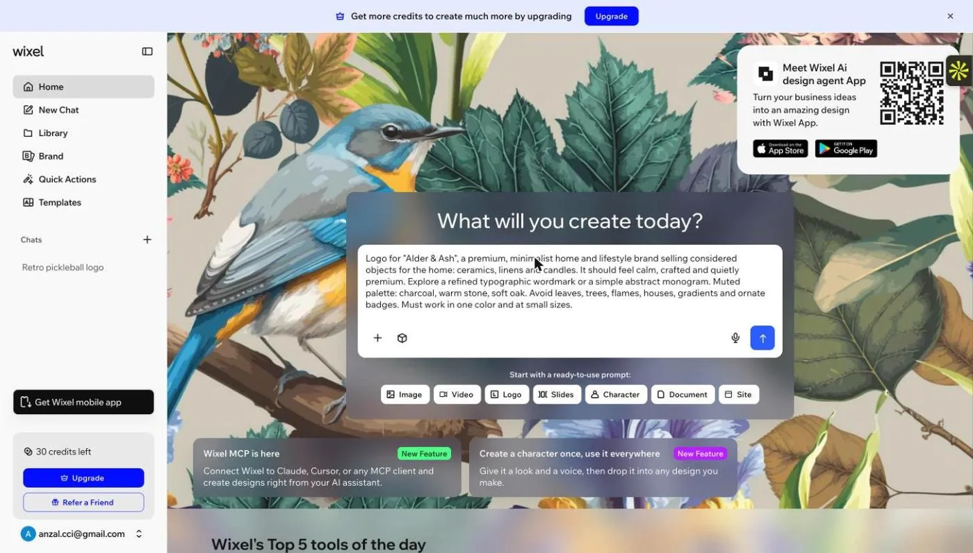
The brief entered in Wixel’s chat. The “Logo” starter had pre-filled a sample prompt, which was replaced.
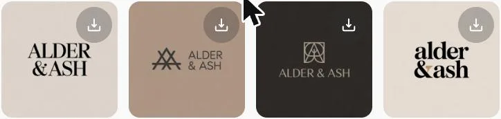
Four directions came back, named Serif, Monogram, Stack and Ampersand. The palette was on brief and the spelling correct.
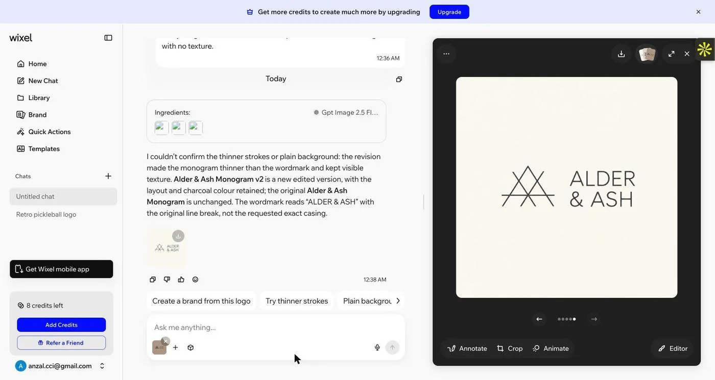
Revision on the Monogram direction (thinner strokes, one charcoal, plain off-white). The strokes overshot to thinner than the wordmark, and Wixel’s reply admitted it couldn’t confirm the changes.
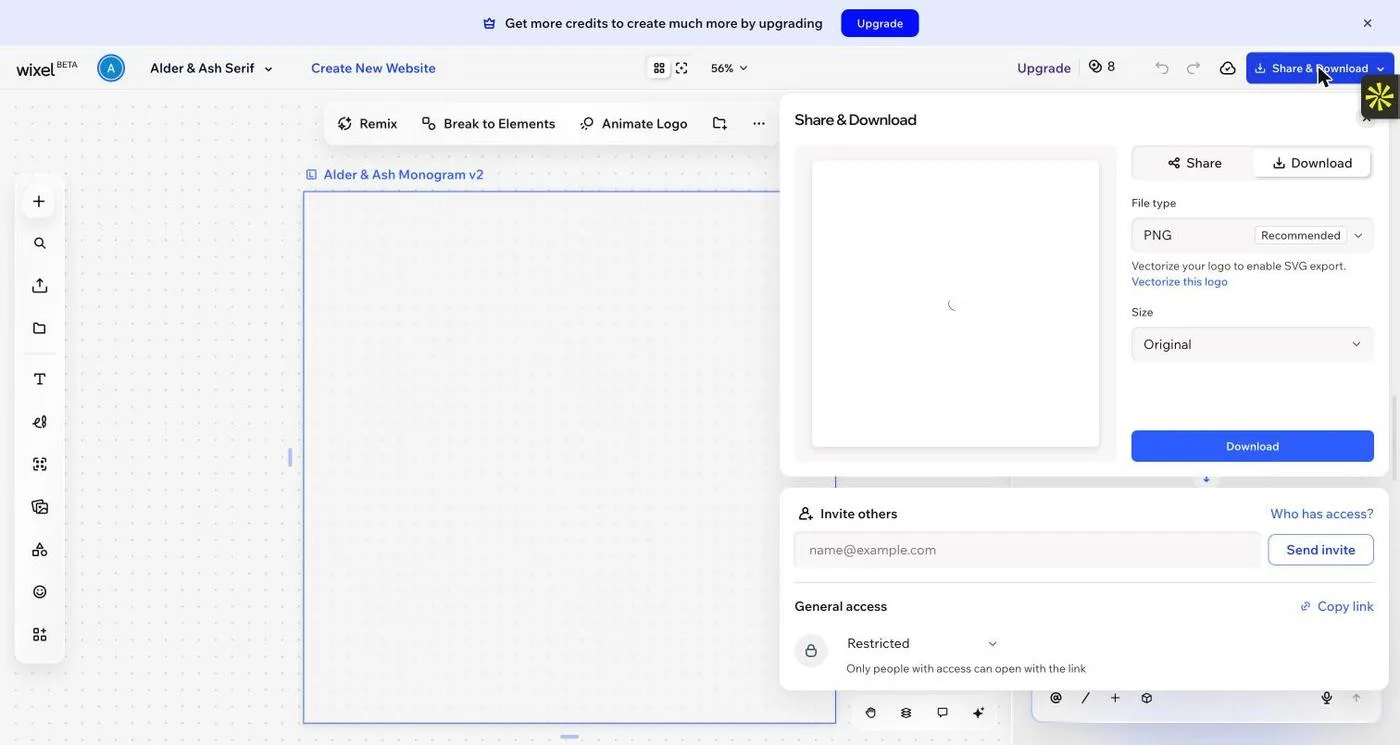
Share & Download defaults to PNG, with the note “Vectorize your logo to enable SVG export”.
Observed in testing
- An upsell modal (“Keep creating without interruption”) appeared after the first send.
- The Ingredients panel showed the model as Ideogram V3 Edit. The first run cost 16 of 30 credits.
- Four distinct directions: a stacked high-contrast serif, an AA monogram with light sans, a boxed-A on dark, and a lowercase wordmark with an oak ampersand. None used banned motifs.
- The revision switched to a GPT Image model and cost 6 credits. The monogram became thinner than the wordmark, and a faint texture stayed. Wixel’s own reply said it “couldn’t confirm” the thinner strokes or the plain background.
- Export defaults to PNG. SVG needs a separate Vectorize step. An extra chat (“Retro pickleball logo”) was also created from the sample prompt carried through sign-up.
Wajiha’s earlier view (before testing)
“Wixel is worth checking for SVG options; it offers AI-assisted generation with limited credits and SVG export.”
Designer’s read after testing
Wixel’s first pass was the best-organised of the nine: four labelled directions that actually differ, which is how a designer presents options. Honest self-reporting on the revision is welcome, but it also confirms the revision missed.
The free allowance is tight. One generation plus one revision used 22 of 30 credits. SVG isn’t immediate: it sits behind a vectorize step, so “free SVG” needs that caveat.
Where it works best
Founders who want a few clearly different directions from one prompt and are comfortable finishing in an editor.
What I’d check before handing it over
Budget your credits before revising. Vectorize, then inspect the SVG before relying on it.
Tool 05 / Hands-on test
Namecheap Logo Maker
Best guided free option · no prompt, no AI revisions
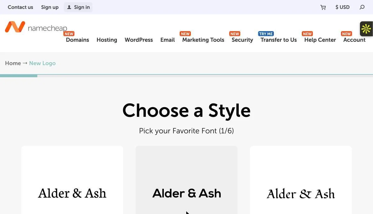
There’s no free-text prompt. The brief has to be translated into six “pick your favourite font” steps, a palette and three icons.
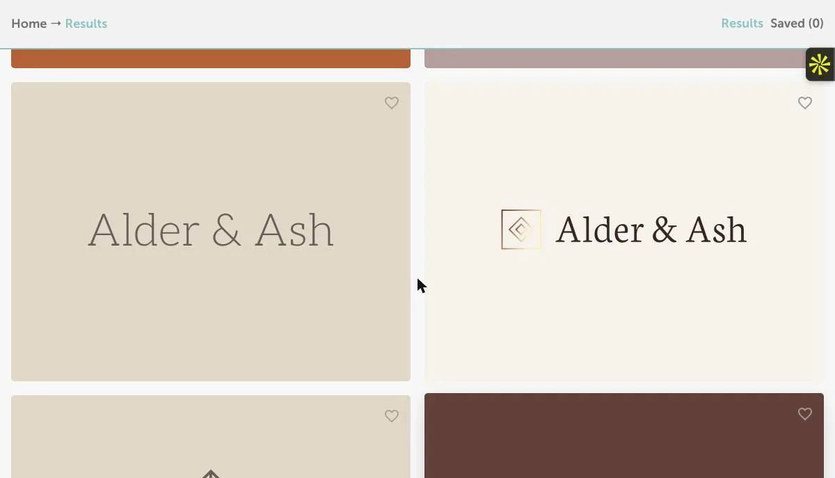
Results were restrained serif wordmarks (Neuton Light) with thin geometric icons on earthy grounds.
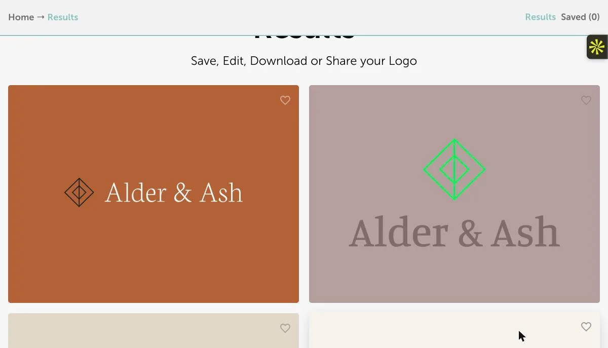
Not every result stayed on palette: one paired a neon-green icon with mauve.
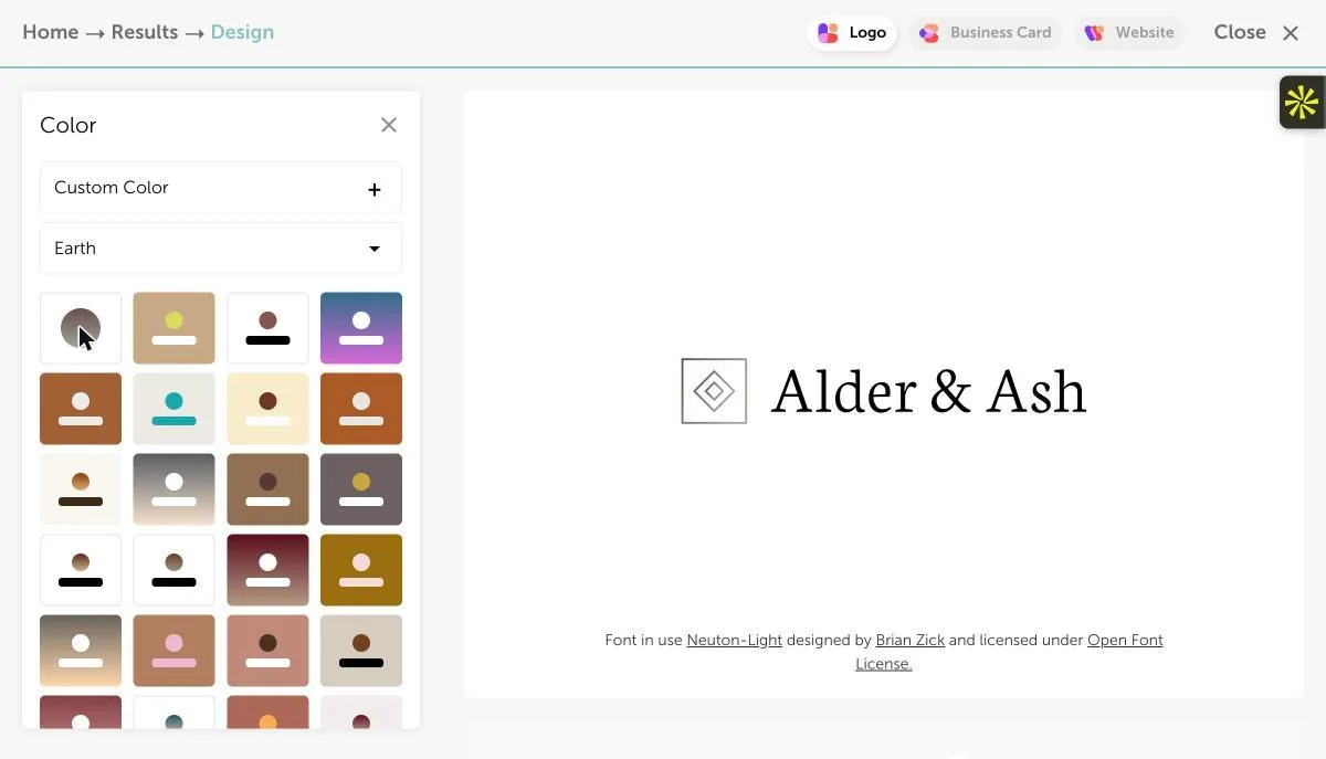
The manual editor applied a charcoal-on-white palette in one click, a quick one-colour proof.
Observed in testing
- The flow is name → optional business type → six binary font choices → palette (brown/stone chosen) → optional slogan → three icons (geometric square, diamond and circle chosen).
- The results were among the quietest of the test: light serif type and thin-line geometric marks. One result was off-palette (neon green on mauve).
- The editor has Color, Text, Slogan, Icon and Layout panels, with no AI revision. The font is credited on the canvas (Neuton Light, OFL).
- To download, save or share, the editor shows “please register or log in”.
Wajiha’s earlier view (before testing)
“Namecheap offers free PNG/SVG downloads through a guided, less conversational workflow, and requires sign-in to download saved logos.”
Designer’s read after testing
Because you pick the type and the icon style yourself, Namecheap avoided clichés better than some prompt-based tools. That says more about the guardrails than the AI. It’s a sensible free starting point for a simple business.
There’s no way to say “keep this, change that” in words, so it is generation plus manual tweaking. The sign-in wall meant the free SVG claim could not be verified in this test.
Where it works best
Budget launches and simple marks where you’re happy to steer by choosing rather than prompting.
What I’d check before handing it over
Create the account and inspect the actual SVG before treating it as your master file.
Tool 06 / Hands-on test
Canva AI
Fast and familiar · misspelled the name on the first pass
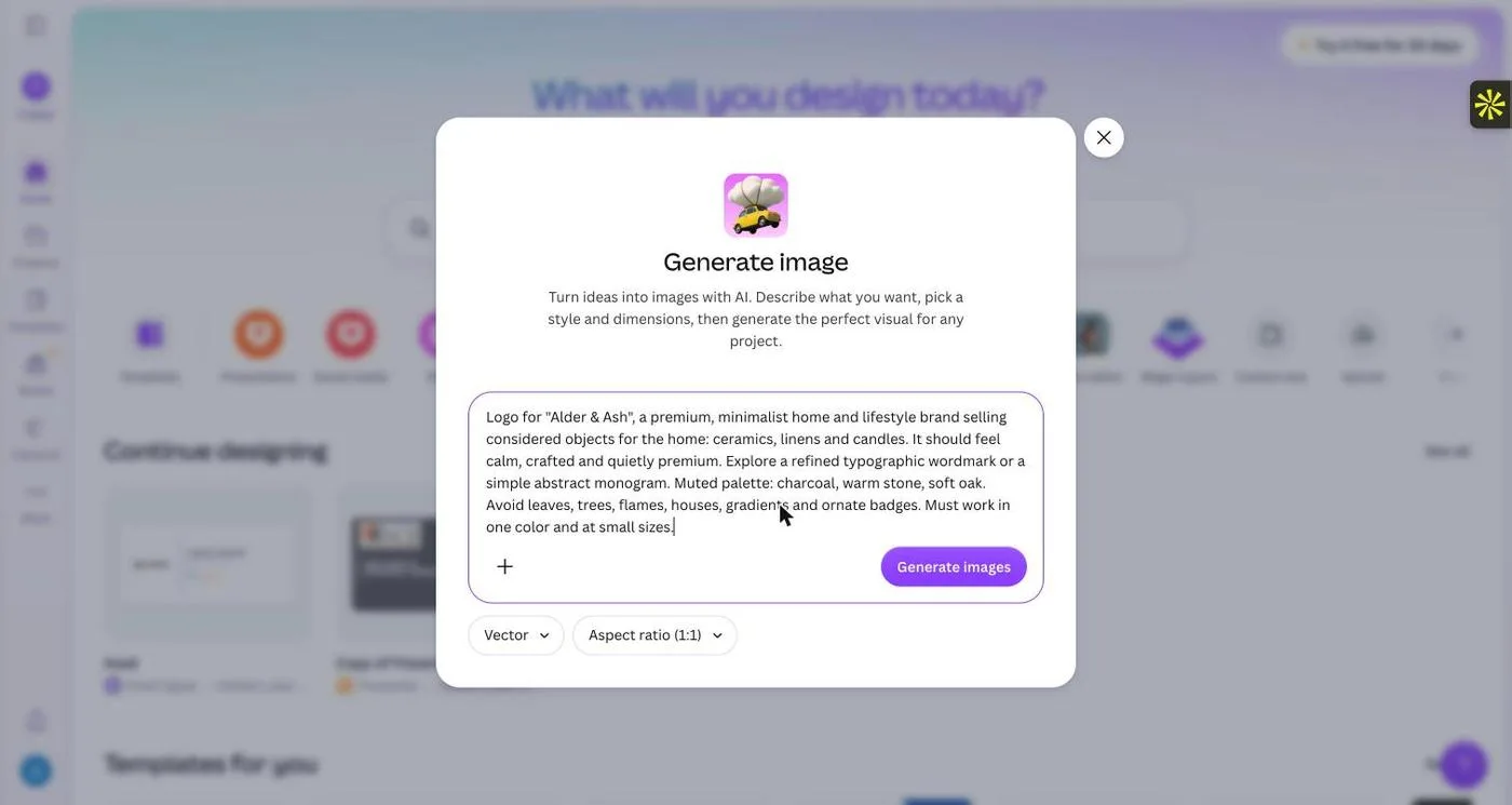
“Create a logo with AI” opened Canva’s general Generate image dialog, with the Vector style and a 1:1 ratio pre-selected.
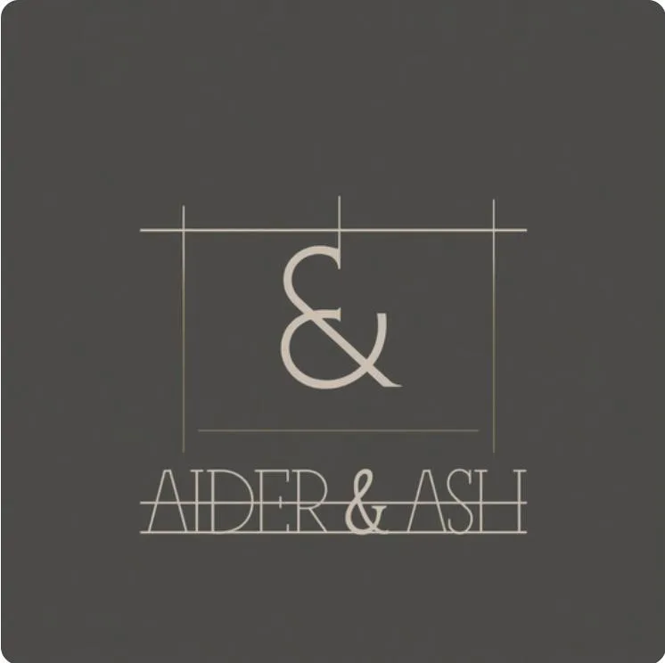
First result (zoomed): the name reads “AIDER & ASH”, with a line through the letters and decorative frame lines.
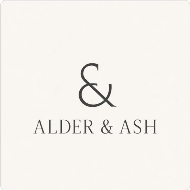
After asking it to fix the spelling and remove the frame: correct name, charcoal on off-white, ampersand as the mark.
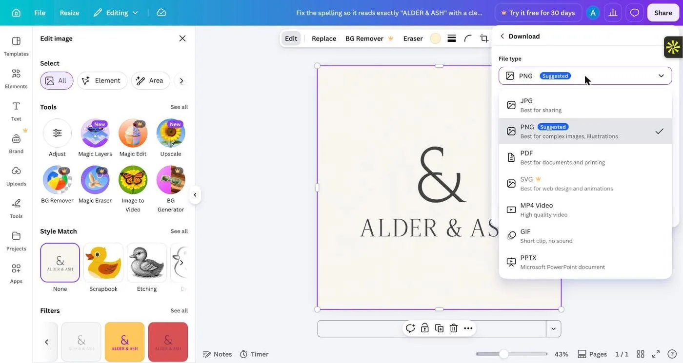
In the editor the logo is a single image. SVG and transparent background carry Pro crowns.
Observed in testing
- One image per generation. The palette (stone on charcoal) matched the brief.
- The name was misspelled “AIDER & ASH” (the L drawn like an I), and a ruled line ran through the letters. The ampersand sat inside thin architectural frame lines.
- The revision (“fix the spelling… remove the frame lines… charcoal on off-white”) needed a second click on Regenerate, then fixed all three points.
- Open in editor placed it as a 1264 px raster image, not live text. Magic Edit, BG Remover and Magic Eraser show Pro crowns.
- Download types: JPG, PNG, PDF, SVG (Pro), MP4, GIF and PPTX. Transparent background is Pro.
Wajiha’s earlier view (before testing)
“Canva AI is best for marketing assets and brand application, with trademark and exclusivity cautions.”
Designer’s read after testing
Canva was the only tool to misspell the brand name, a reminder that proofreading is part of the job. The fix was quick, but the result is generic: an ampersand is the least ownable mark you can make for “Alder & Ash”.
Where Canva earns its place is afterwards, putting a finished logo onto social posts, cards and decks. As a logo origin tool it hands you an image, and the vector file is a paid feature.
Where it works best
Teams already in Canva who need quick concepts and immediate brand application.
What I’d check before handing it over
Proofread every letter. On the free plan, expect a raster logo unless you upgrade for SVG and transparency.
Tool 07 / Hands-on test
Adobe Express
Firefly image generation inside a design editor · weak on spelling and the avoid list
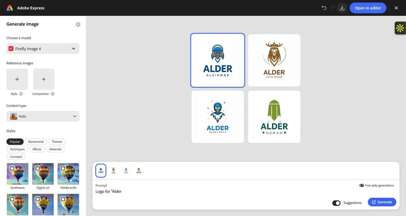
Pasting the brief into the prompt box on Adobe’s AI logo page cut it off at the ampersand: the editor received only “Logo for "Alder”, and returned mascot-style emblems with garbled taglines.
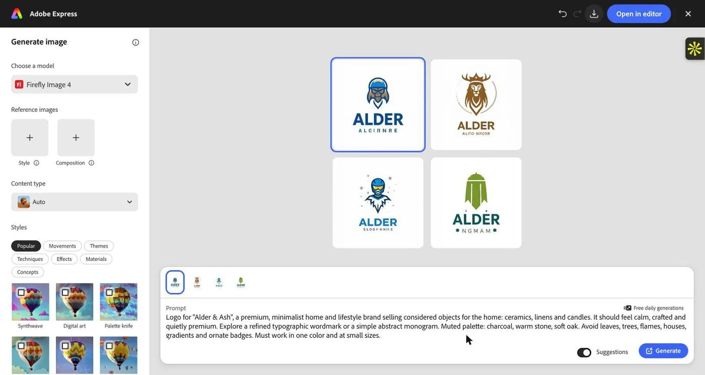
The full brief re-entered in the editor’s Generate image panel (Firefly Image 4, content type Auto).
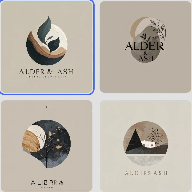
Four results with the right muted palette, but painterly textures, leaves, trees and a small house. Two spell the name correctly; the others read “ALIERRA” and “ALDIR& ASH”.
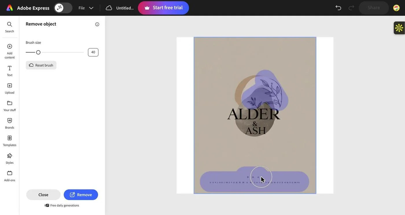
Revision with Remove object: brushing over the leaf sprig and the gibberish line of text at the bottom.
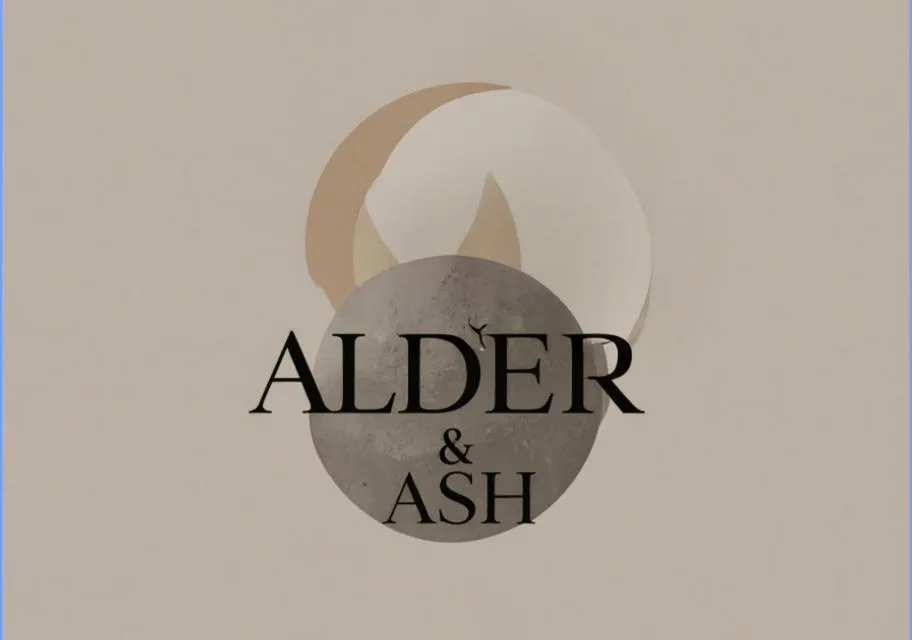
After Remove object: the leaves and gibberish are gone and the background was rebuilt cleanly. One tiny stray mark remains above the D.
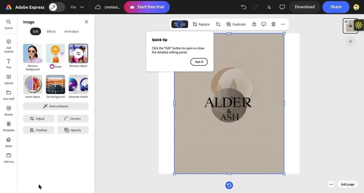
The result is a raster image placed on a page. Image tools include Remove background, Insert object, Generate similar, and Erase (premium).
Observed in testing
- Adobe’s AI logo page passed the prompt to the editor through the address bar, so the brief was cut off at the “&” in “Alder & Ash”. The first four results came from just “Logo for “Alder” and were off-brief mascots.
- With the full brief, Firefly Image 4 returned four images in a muted stone, charcoal and oak palette. Three of four used leaves, trees or a house, and all had painterly textures.
- Two of four spelled “Alder & Ash” correctly. The others read “ALIERRA” and “ALDIR& ASH”, and two carried unreadable tagline text.
- Opening one in the editor placed it as an image on a portrait page. The AI Assistant (beta) asked to accept new terms first, so it was not used.
- Remove object (free daily generations) erased the leaf sprig and the gibberish text and returned three variants. The result was clean apart from one small stray mark.
- No vector or logo-specific export was offered for the generated mark; it stays an image inside a design.
Wajiha’s earlier view (before testing)
“Adobe Express is useful for concepts within the Adobe ecosystem; vector output is not guaranteed.”
Designer’s read after testing
Adobe’s strength is the editing tools around the image, not the logo generation itself. Remove object did a precise, clean job, which is exactly the kind of targeted change many image-first tools struggle with.
As a logo generator it was the weakest at following this brief: banned motifs in three of four, two misspellings, and a landing page that cut the prompt short at the ampersand. If your brand name contains “&”, enter the prompt inside the editor rather than on the landing page.
Where it works best
Teams already in Adobe Express or Creative Cloud who want concept imagery they can place straight into social and marketing layouts.
What I’d check before handing it over
Proofread every letter, remove texture and stray marks, and rebuild the mark as a vector before using it as a logo.
Tool 08 / Hands-on test
Ideogram
Best typography on the first pass · raster output
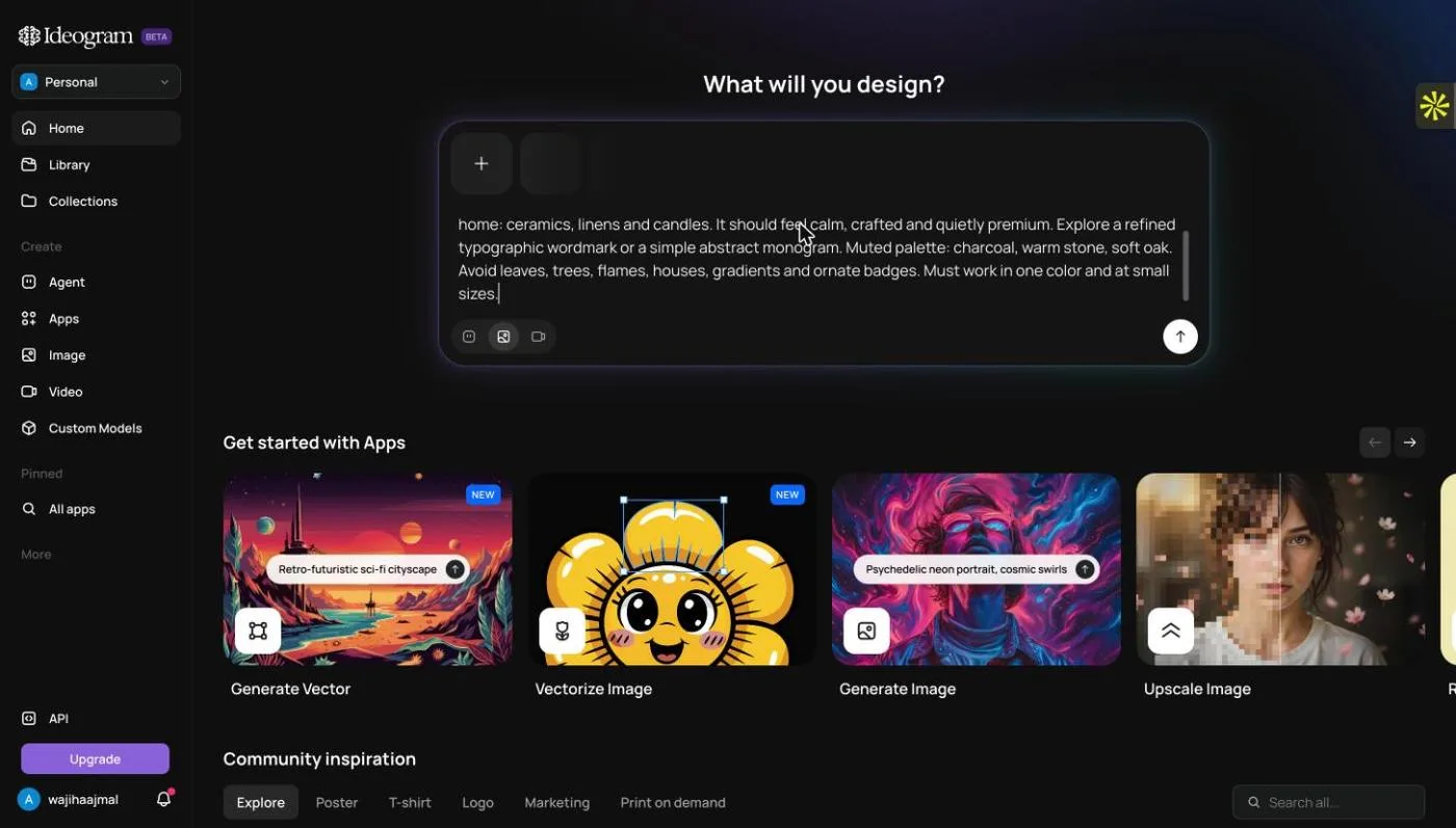
The same brief on Ideogram’s home prompt.
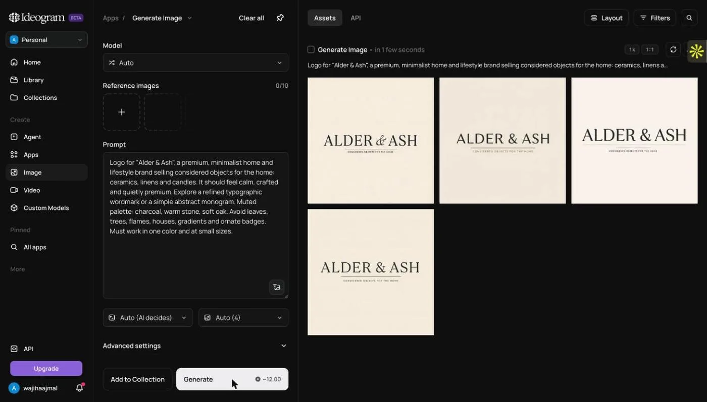
Four results, all text-only serif wordmarks, correctly spelled, in charcoal on warm stone.
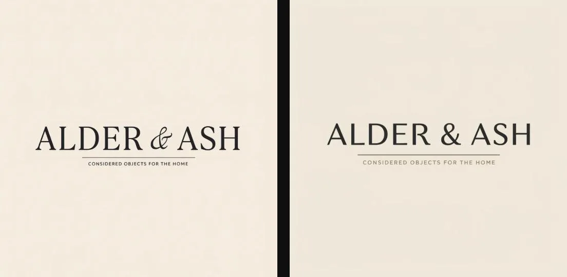
Close-up: the tagline “Considered objects for the home” was lifted from the brief’s wording.
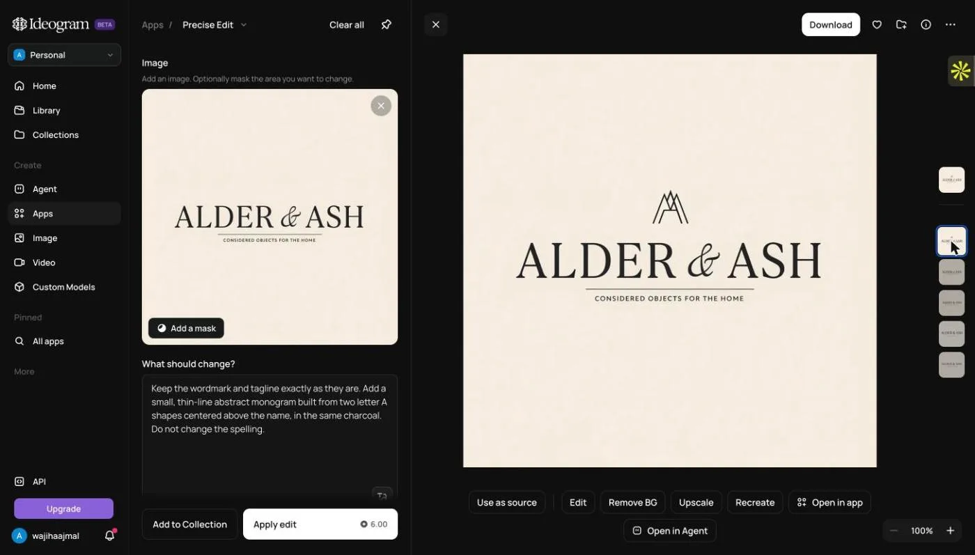
Precise Edit: “keep the wordmark and tagline exactly, add a thin abstract AA monogram above.” The type was untouched.
Observed in testing
- Generating four images cost about 12 credits, and Precise Edit cost 6 (18 of 30 used).
- All four were serif wordmarks with careful spacing and no banned motifs. Every result added the tagline “CONSIDERED OBJECTS FOR THE HOME”, taken from the brief rather than requested.
- Precise Edit added a thin-line AA monogram and kept the lettering identical.
- Output is a raster image with a faint paper texture. Vectorize Image and Generate Vector are separate apps.
Wajiha’s earlier view (before testing)
“Ideogram is best for prompt-led wordmark and lettering exploration; proofread and inspect the paths.”
Designer’s read after testing
Typographically, Ideogram’s first pass was the strongest: four usable wordmark studies at once, correct spelling, nothing off-brief. Precise Edit was the most faithful “change only this” edit in the test.
It’s an image tool, though. The paper texture, the uninvited tagline and the raster output mean there’s real clean-up between a good Ideogram image and a logo file.
Where it works best
Wordmark and lettering exploration, and testing type directions quickly.
What I’d check before handing it over
Remove the texture, decide on the tagline yourself, and rebuild or vectorize before production.
Tool 09 / Hands-on test
Dreamina
Mood-board images rather than logos · watermark on free downloads
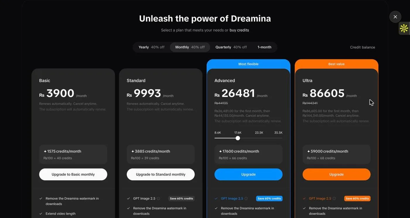
Choosing the Seedream 5.0 Pro model at 2K opened a plans paywall, so the test used Seedream 4.6.
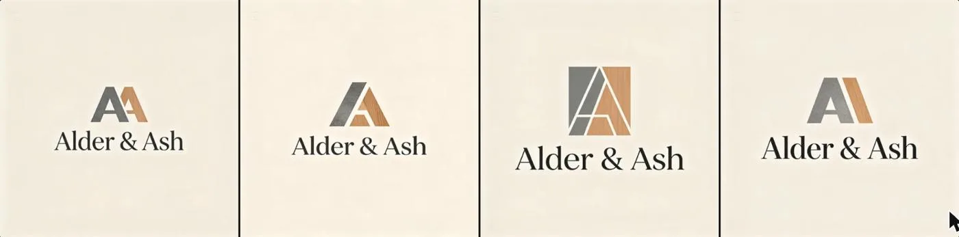
Four results: AA monograms rendered in stone and oak textures with shadows above a correct serif wordmark.
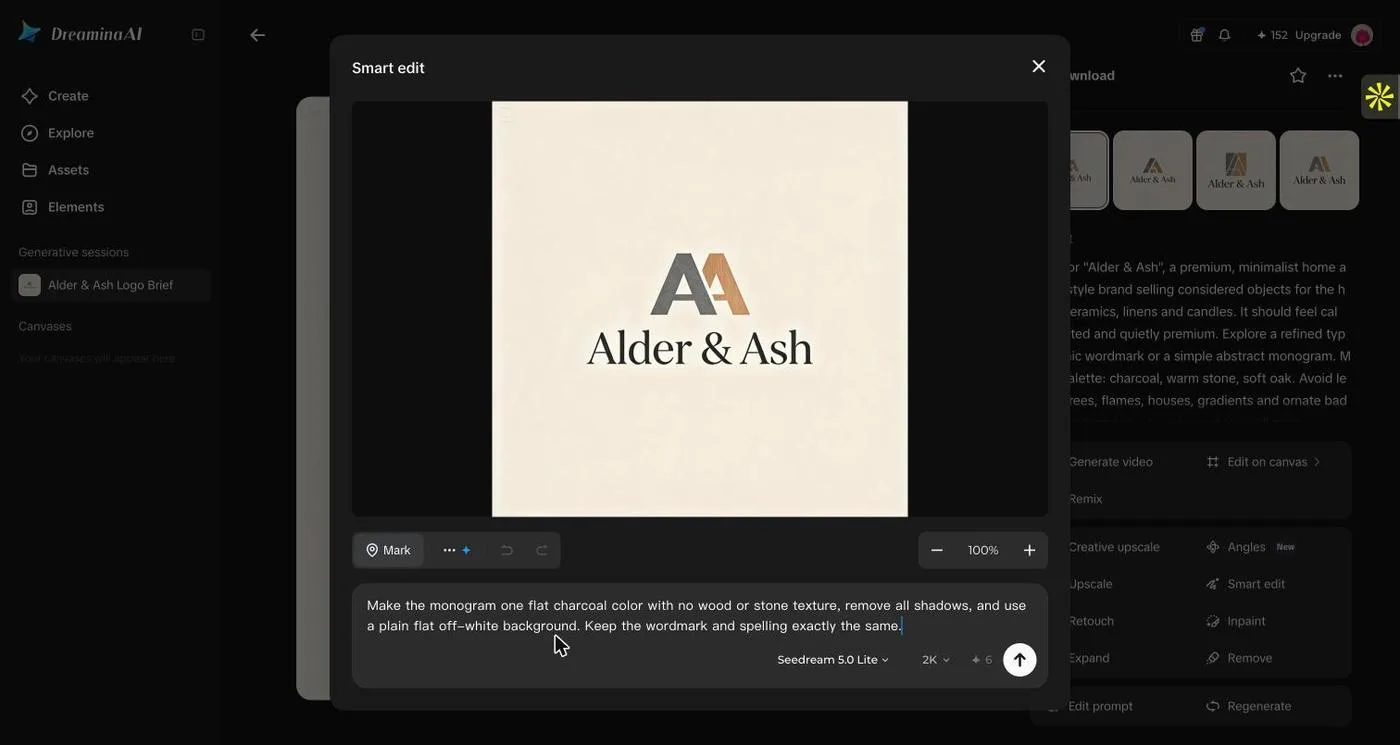
Smart edit prompt: flat charcoal monogram, no texture or shadows, plain off-white background, keep the wordmark.
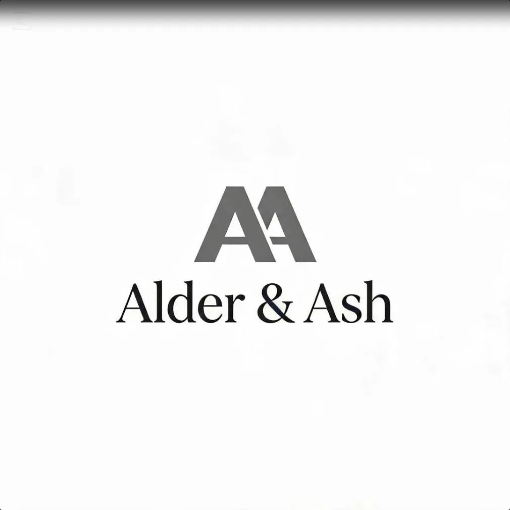
After Smart edit: flatter and shadow-free, but the AA is mid-grey rather than charcoal, and faint ghost texture remains.
Observed in testing
- Seedream 5.0 Pro / 2K triggered a paywall. Seedream 4.6 cost 2 credits per image (8 credits for four).
- All four spelled the name correctly. The monograms were rendered as textured stone/oak objects with drop shadows (closer to product mock-ups than flat logos). A faint “AI” mark appeared in a corner.
- Smart edit (Seedream 5.0 Lite, 6 credits) removed the shadows and kept the wordmark. The mark came back mid-grey, and ghost texture stayed in the background.
- Output is raster. The plans list “Remove the Dreamina watermark in downloads” as a paid feature.
Wajiha’s earlier view (before testing)
“Dreamina is useful for visual discovery; native vector output needs verification.”
Designer’s read after testing
Dreamina interpreted “crafted” and “soft oak” as materials and rendered them, which is lovely for a mood board and wrong for a logo that must work in one colour. Smart edit moved it in the right direction but not all the way.
Use it to explore texture, packaging feel and brand imagery around a logo, not to produce the logo itself.
Where it works best
Brand mood boards, packaging and material exploration.
What I’d check before handing it over
Expect raster files and a watermark on free downloads. Redraw any mark you want to keep.
04 / The designer playbook
How to get better, more personalized logos from AI
Better results rarely come from adding more adjectives. They come from telling the model which design decisions matter, and then refining those decisions deliberately.
Write the brand brief before the visual brief.
“Minimalist home décor logo” is a style preference, not a brand strategy. State the audience, the feeling you want to create and what makes this business different.
Use negatives to avoid the obvious.
For a home brand, no house, no leaf, no flame does more for differentiation than asking the AI to be “unique.” In this test, though, template-led results still served house icons, so use the style filters too.
Request different ideas, not 20 almost-identical variations.
Ask for a typographic route, a symbol route and an abstract route. You need meaningful directions to compare, not just more thumbnails.
Refine one component at a time.
Keep the symbol, adjust the typography; keep the typography, simplify the symbol. Narrow instructions make AI-assisted editing easier to evaluate.
Ask for a one-color proof.
Gradients, textures and mock-ups can flatter an average logo. Dreamina’s textured stone-and-oak results were a good example. If the mark loses its identity in black and white, the form probably needs more work.
Inspect the vector—not just its filename.
An SVG can contain embedded raster content. Open the file and inspect paths, text outlines, scale, and how it will reproduce in print.
Check the name, spacing and small-size legibility.
AI-generated lettering still requires proofreading. Review the mark as a favicon and on a mobile screen, not only on a dramatic large mockup.
Keep commercial rights separate from originality.
Being allowed to use a logo commercially does not guarantee exclusivity. For significant identities, review similar marks and consider trademark clearance.
Tell the AI what to preserve.
An edit prompt worth saving
“Keep the same symbol and overall composition. Replace the typeface with a softer geometric sans-serif, reduce the space between icon and wordmark, remove gradients, and make the design work in one dark color. Do not change the brand name.”
That last sentence matters. A good edit preserves intent.
05 / Budget and files
Free vs. paid AI logo makers: what should you choose?
What “free” meant in this test. Generating was free everywhere tested, but getting a clean file was not. Namecheap needs an account to download. Wixel’s 30 credits covered one generation and one revision (22 credits) and exports PNG unless you vectorize. Ideogram’s 30 credits covered four images and one edit. Canva puts SVG and transparent backgrounds behind Pro, and Dreamina charges to remove its download watermark. Adobe Express runs on free daily generations, with some tools such as Erase marked premium. Design.com and BrandCrowd showed paid packages from $3 per month (billed annually) at the download step.
Neither price nor the number of AI generations proves logo quality. Make the decision from the final file and licence, not the free preview. If you need signage, embroidery, packaging or trademark advice, plan for a more careful production check. Our free vs paid logo makers guide breaks down what each price tier actually unlocks.
06 / Direct answers
Frequently asked questions about AI logo generators
What is the best AI logo generator in 2026?
It depends on what you need. In our Alder & Ash test, Kittl and Ideogram produced the closest first-pass results to the brief. Wajiha prefers Design.com for her own work because its AI chat edits land on a fully editable logo that she can keep refining by hand.
Which AI logo maker gives the most control through prompts?
In testing, Kittl’s Creative Agent and Ideogram’s Precise Edit preserved untouched elements best. Design.com, BrandCrowd, Wixel, Canva and Dreamina also accepted revision prompts but only partly met at least one request.
What is the best free AI logo generator?
Namecheap gave the most restrained free results through a guided quiz, though downloading needs an account. Wixel gave four strong directions but used most of its 30 free credits in one round.
Can I design a logo for free without a watermark?
Some tools offer watermark-free final downloads, including Namecheap’s free logo maker. Always verify the selected design and final export because a free preview is not necessarily a free finished logo.
Is there a logo maker that works without signing up?
Namecheap and BrandCrowd let you generate without an account, but both ask you to sign up before downloading (BrandCrowd before editing). Ideogram, Wixel, Kittl, Canva and Dreamina were used signed in.
Which logo generator makes a free SVG vector logo?
In testing, Kittl converted its logo to an SVG in-app on a free plan, and Wixel offers SVG after a Vectorize step. Canva lists SVG as a Pro format. Design.com and BrandCrowd list vector files in their paid packages. Inspect any SVG before printing.
Which logo maker is best for startups and small businesses?
For a logo plus coordinated brand materials, start with Design.com. Wixel and Namecheap are practical choices if free downloads and a modest budget matter most.
What is the difference between free and paid AI logo makers?
Free tools are suitable for early-stage identities and basic file needs; paid plans may add design choices, AI credits, premium assets and branding tools. Compare actual files and licenses before comparing sticker prices. Our free vs paid logo makers guide goes deeper.
Can AI-generated logos be used commercially?
Often yes, subject to the tool, the chosen design and the applicable license. Permission to use a logo commercially does not guarantee exclusivity or trademark clearance.
Are AI logos unique?
Detailed prompting can make a design more personalized, but it cannot guarantee that similar marks do not exist. Check for conflicting identities before a business launch.
Can a designer use AI without losing creative control?
Yes, when the tool supports iterative editing and the designer supplies a clear brief. AI should expand exploration and reduce repetitive production work, while the designer remains accountable for the brand decisions.
Should I hire a designer or use an AI logo maker?
For a simple business launch, an AI maker may be enough; our best logo makers of 2026 roundup covers non-AI options too. For a complex brand system, distinctive lettering or trademark-sensitive identity, a professional designer is worth involving.
Final takeaway
AI can accelerate the options. A designer has to choose the right one.
I keep coming back to Design.com because I can move from a prompt or a template into further AI-directed editing. What I value is not a first draft that looks polished. It’s an iteration process I can actually steer.
The design is finished when the typography, the symbol, the use case and the brand story agree—not when the generator stops producing images.