A wordmark logo turns a brand name into its most recognizable visual asset. There is no separate symbol to do the heavy lifting: the letters, their shapes, and the space between them have to carry the identity.
That sounds simple until you try to make a name feel distinctive without making it difficult to read. For me, this is where branding becomes especially interesting. A refined serif can suggest confidence; a rounded sans serif can feel approachable. But neither becomes a strong logo until it fits the business, its audience, and the places it needs to appear.
The quick answer
A wordmark is a text-based logo built around a brand’s written name, such as Google, Coca-Cola, Netflix or FedEx. It uses distinctive typography or custom lettering rather than a separate pictorial symbol. You can create one with an AI logo maker such as Design.com, which generates and edits the lettering for you, or manually in a vector editor such as Adobe Illustrator, where you set, space and refine every letter yourself.
What is a wordmark logo?
A wordmark, also called a logotype, makes the name itself the identifying mark. It can use an existing typeface, modified type, or lettering drawn specifically for the brand. It can be uppercase, lowercase, mixed case, or script.
The important distinction is intention. Typing a company name in a font gives you a starting point. Deciding how those particular letters should fit together, and how that arrangement should work consistently across packaging, websites and signage, is wordmark design.
A wordmark does not have to contain a hidden message or a dramatic custom letter. Recognition can come from a distinctive overall silhouette, an unusual rhythm, a characteristic ampersand, or simply a well-chosen design used consistently.
Wordmark vs. lettermark, monogram, and combination mark
| Logo type | What identifies the brand | Example |
|---|---|---|
| Wordmark | The written brand name | Google or Coca-Cola |
| Lettermark | Initials or an abbreviation | IBM |
| Monogram | Letters joined or arranged as one device | The interlocking Louis Vuitton initials |
| Combination mark | A name paired with a separate symbol | A fictional Verelle wordmark beside a droplet icon |
These categories can overlap. A monogram is often a kind of lettermark, and a brand can have a wordmark alongside a separate icon. The Netflix name and its N symbol, for example, serve different roles within the same identity.
A short history of the wordmark
There is no useful single “invention date” for the wordmark. Written trade names, lettering and commercial printing developed over time. A better way to understand its history is to follow how businesses have used letters to build recognition.
Handwritten character: Coca-Cola’s 1886 name and Spencerian-inspired script show how a distinctive written signature could identify a product. The lettering carried personality long before brands had to think about an app icon.
Systematic corporate identity: IBM’s history moves from an elaborate globe of words to abbreviated lettering, then Paul Rand’s striped identity in 1972. IBM is a lettermark, but its evolution illustrates a broader shift toward repeatable, carefully controlled typographic identities.
Meaning inside the letters: The 1994 FedEx identity demonstrates how negative space can become part of a name’s construction. A visual idea does not always need a separate illustration.
Identity across screens: Google’s 2015 redesign treated its wordmark, compact G and animated dots as related elements. The task had expanded from drawing a memorable name to making that identity work across devices and interactions.
The practical lesson is continuity. A wordmark can evolve as its applications change while retaining enough familiar features for people to recognize it.
Famous wordmark logos, and what designers can learn from them
1. Coca-Cola: personality through lettering
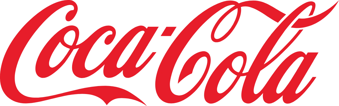
The documented story: Coca-Cola credits Frank M. Robinson, John Pemberton’s partner and bookkeeper, with proposing the name in 1886 and developing its treatment from Spencerian penmanship. The company’s chronology also records changes to the script and its surrounding elements over time. It is a lasting identity, not a design that has literally never changed.
My designer’s reading: The repeated capital Cs, flowing connections and distinctive silhouette make the name feel like one piece of lettering. The lesson is not to add flourishes to every logo. It is to develop a consistent visual voice across the whole word, rather than decorating one letter and leaving the others unrelated.
2. FedEx: negative space with a purpose
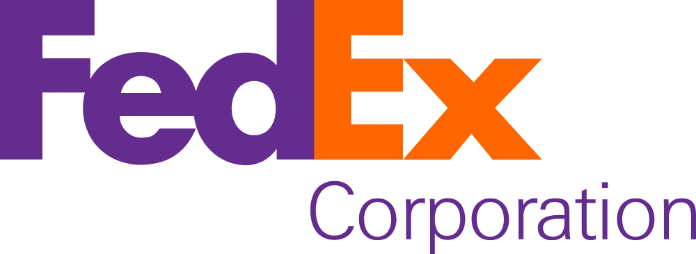
The documented story: Lindon Leader designed the FedEx logo in 1994 while working at Landor Associates. His ArtCenter profile identifies the hidden arrow as the design’s signature feature.
My designer’s reading: The arrow between the E and x works because the surrounding letters remain readable. It adds an extra discovery without turning the name into a puzzle. When experimenting with negative space, I would first ask whether the word reads naturally. A clever detail that weakens the name is a poor trade.
3. Google: a wordmark designed as part of a system
The documented story: Google’s account of its 2015 identity describes a sans serif logotype that retained its colour sequence, a compact G for small contexts, and dots for interactive states. The redesign addressed a growing range of devices and uses.
My designer’s reading: A wordmark does not have to solve every application alone. Google is a useful reference when a founder wants a long business name to fit into a tiny profile circle. Preserve the name where it can be read, and develop a related compact mark for constrained spaces.
4. Netflix: the full name and the compact symbol
The documented distinction: Netflix’s official brand guidance treats the Netflix wordmark and the N symbol as separate assets, and its partner guidance distinguishes between using the full logo and using the symbol.
My designer’s reading: The recognizable name and the compact initial are complementary. This is a useful contemporary example of responsive branding: change the asset to suit the space, rather than squeezing the entire wordmark until its letters become unreadable. The N is not, by itself, a wordmark.
When should a business use a wordmark?
A wordmark is a strong option when the name is distinctive, reasonably easy to read, and worth making familiar. It can be especially useful for a new business because the logo tells people what the company is called every time they see it.
I would shortlist a wordmark for a skincare label, consultant, studio, fashion brand, or software company with a memorable name. I would be more cautious with a very long name, an unfamiliar spelling, or a business whose main visibility comes from tiny app and social icons.
A generic name also creates a challenge. Beautiful typography can improve presentation, but it cannot make a widely used business name inherently distinctive. Resolve naming and positioning questions before spending hours adjusting the logo’s letter spacing.
The typography decisions that make a wordmark work
Choose the letterforms before the font category
“Serif means premium” is too broad to guide a brand identity. A delicate, high-contrast serif, a sturdy slab serif and a warm old-style serif can communicate very different things. Look at the actual name: its repeated shapes, ascenders, diagonals and troublesome pairs.
For the worked example in this guide, Verelle, a fictional clean-skincare brand, I would study the diagonal V against the upright E, the repeated E–R–E rhythm, and the double L, where two verticals sit side by side. Those details matter more than whether a font appears in a list of “luxury logo fonts.” Compare typefaces at a similar visible letter height, not merely the same point size.
Understand kerning, tracking, and optical balance
Kerning adjusts the space between particular letter pairs. Tracking changes spacing across a range of letters. Tracking can establish a general rhythm; kerning corrects the local interruptions.
Equal numerical gaps do not look equal. A diagonal V creates a wedge of white space beside an E; two Ls create a tall, straight-sided gap. Judge the areas between letters, not just the distance between their bounding boxes. Review the entire word after each adjustment so one “perfect” pair does not disrupt the rest.
Optical centering follows the same principle. A word can be mathematically centred yet appear to lean because one side carries more visual weight. A small visual correction is sometimes appropriate, but document the final lockup so future users do not keep repositioning it.
Protect counters, contrast, and small details
Counters are the enclosed or partly enclosed spaces within letters. When a logo gets smaller, narrow counters and thin strokes can lose definition. High stroke contrast may look elegant on a large presentation slide and fragile on a small woven label or a 30 ml bottle.
Established typefaces already include optical corrections, such as rounded forms extending slightly beyond flat alignment lines. Preserve those relationships when modifying letters. If you draw custom shapes, compare curves and flat forms visually rather than forcing every point onto an identical boundary.
Customize with a reason
A custom terminal, a quieter R leg or an adjusted crossbar can make a useful difference. Modifying every letter usually creates more problems than it solves. Keep stroke logic, curve tension and serif treatment consistent across the name.
A ligature joins letters into a single form. Use one when it improves rhythm or expresses something appropriate about the brand; reject it when it makes two letters look like another character. Do not automatically add tracking to a connected script: breaking intended joins can damage the lettering.
Two ways to create a wordmark: with AI, or by hand
There are two genuinely different routes to a finished wordmark, and it helps to choose deliberately rather than drift between them. The rest of this guide walks through both using the same fictional brand, Verelle: a premium clean-skincare label that wants a calm, refined, text-only logo in deep forest green.
Method 1 · AI-assisted
Create with an AI logo maker
You describe the brand and the AI generates lettering directions. You then refine in an editor, by prompt or by hand.
- Best for: founders, fast starts, small budgets
- Time: minutes to an hour
- Skills needed: a clear brief and a critical eye
- Tool used here: Design.com
Method 2 · Manual
Create by hand, like a designer
You sketch, set the name in a licensed typeface, then kern, customise and export it yourself in a vector editor.
- Best for: designers, distinctive or custom lettering
- Time: hours to days
- Skills needed: typography and vector editing
- Tools: Illustrator, Figma, Affinity, Inkscape, Glyphs
Neither route is automatically better. AI is faster at producing options; manual work gives you control over every curve and gap. Many designers combine them: an AI maker for early directions, then a vector editor to finish the letters.
Method 1
How to create a wordmark with AI (Design.com walkthrough)
A real session in Design.com, 23 October 2026, building the Verelle wordmark from a written brief.
I used Design.com because it combines prompt-based generation, a large template library and an editor where the result stays editable: live text, adjustable spacing and colour swatches rather than a flat picture. Each step below is a screenshot from the session.
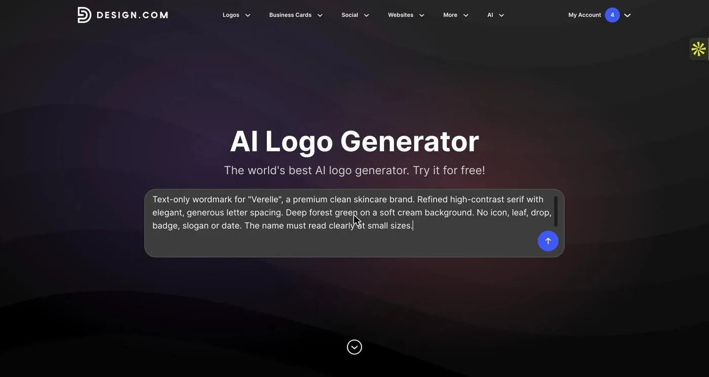
Write a text-only brief
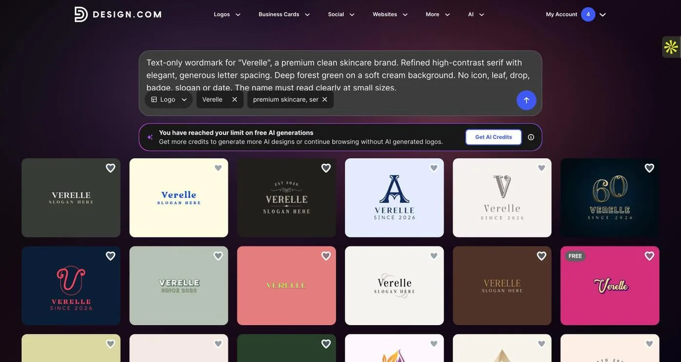
I entered: “Text-only wordmark for ‘Verelle’, a premium clean skincare brand. Refined high-contrast serif with elegant, generous letter spacing. Deep forest green on a soft cream background. No icon, leaf, drop, badge, slogan or date.” Saying text-only and listing exclusions stops the generator from returning a combination mark.
Review the concepts against the brief
Design.com turned the brief into a name chip (“Verelle”) and keywords (“premium skincare, serif typography”). On this account the free AI generations had been used up, so it returned its matching designs without the AI-generated row, with a prompt to add AI credits. Every result spelled Verelle correctly; many still carried “SLOGAN HERE” or “SINCE 2026”, which I would remove.
Pick the strongest letter structure
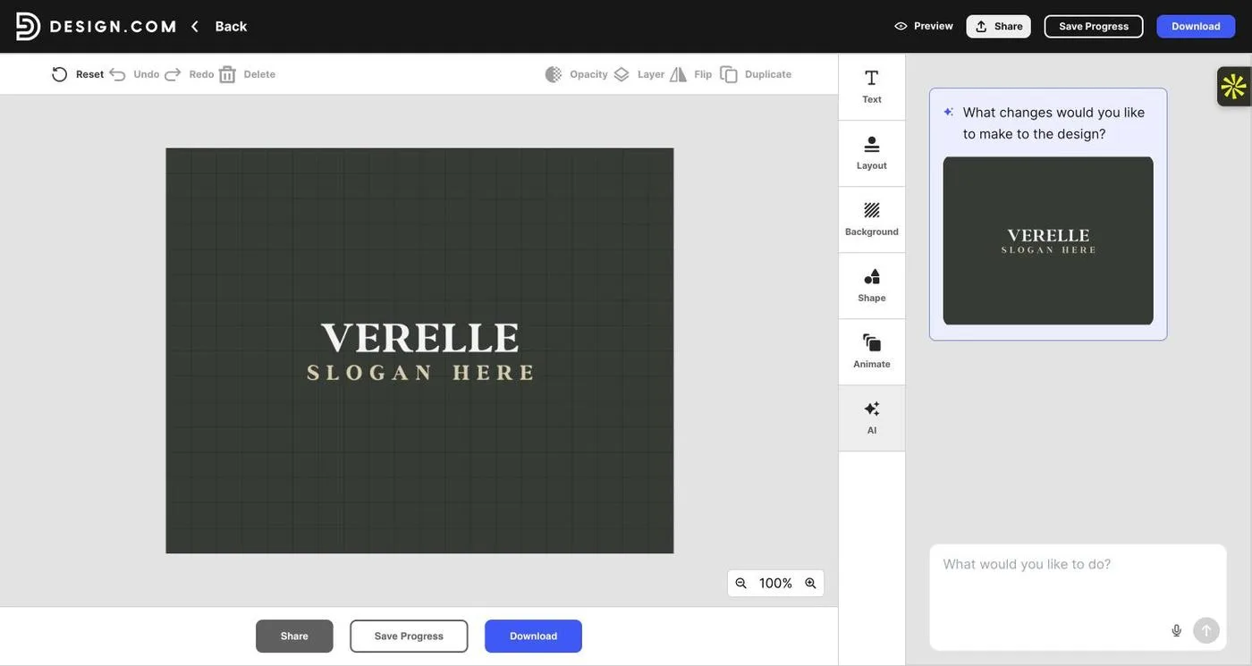
I chose the plainest serif lockup: VERELLE in caps over a placeholder slogan. I picked it for the letter structure, not the colours. Colour and spacing are easy to change; the bones of the letters are not.
Ask the AI chat for changes
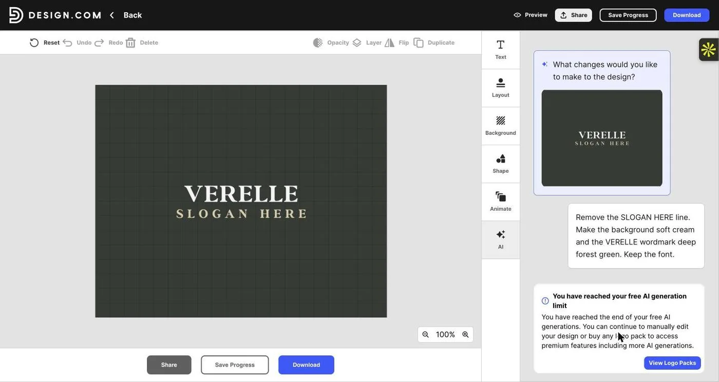
Design.com’s AI chat can apply edits in plain language. My request (“remove the slogan, cream background, deep forest green wordmark, keep the font”) returned the free-limit message. AI chat edits use credits, which come with Design.com’s packages; manual editing stays free.
Set the colour by hex value
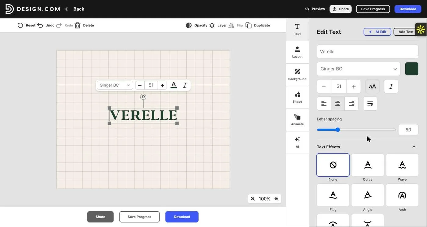
In the editor I deleted the slogan, set the background to cream (#F4EFE6) and the lettering to deep forest green (#1F3D2B) with exact hex codes. These are the values I would carry into the brand guidelines.
Refine the typeface and tracking
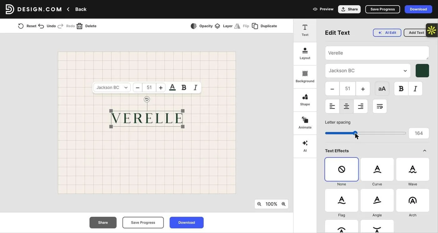
The template’s bold serif felt heavy for skincare, so I switched to Jackson BC, a lighter high-contrast serif, and raised letter spacing from 50 to 164. The wider tracking gives the double L room and calms the E–R–E rhythm.
Add a descriptor and preview
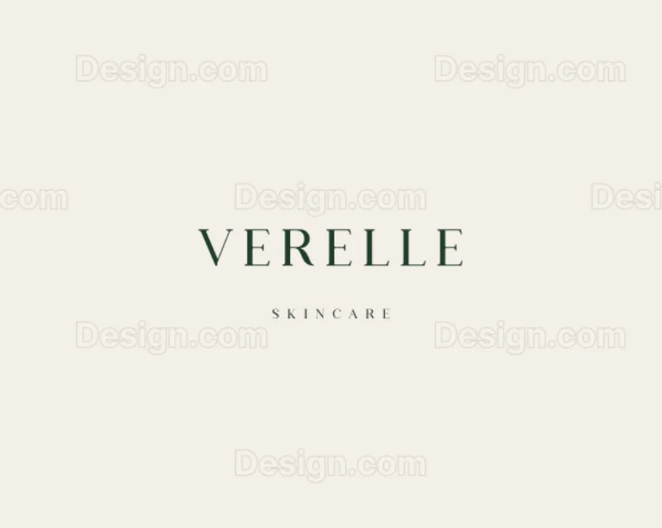
I added “SKINCARE” in the same typeface at 13 pt with very wide spacing, so it reads as a quiet descriptor rather than a second logo. The preview shows the finished Verelle wordmark (watermarked until downloaded) and places it on mock-ups such as a phone screen and business cards.
Choose how to export
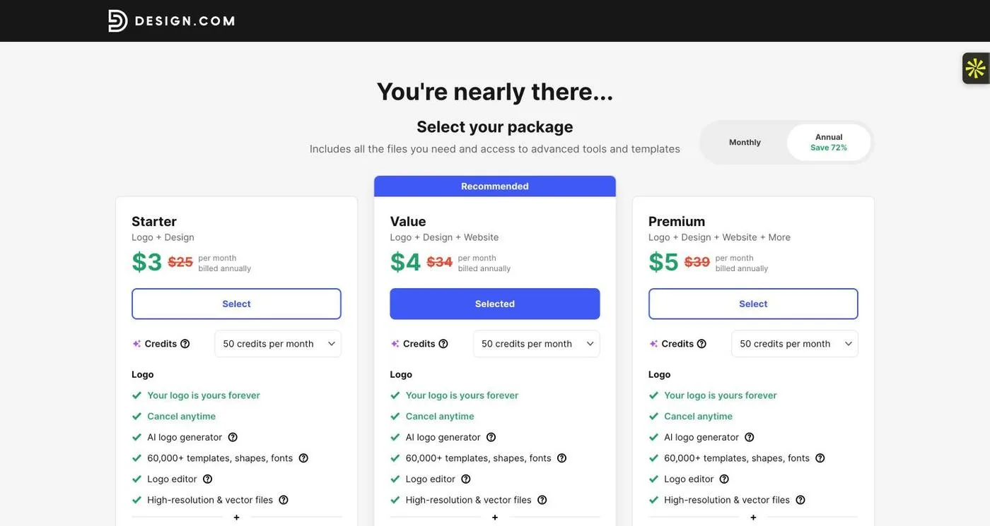
Downloading opens package selection. Each package lists high-resolution and vector logo files, 50 AI credits a month, and access to 60,000+ templates, shapes and fonts. I saved the design to the account rather than buying.
What to check before you download an AI-made wordmark
Read the name letter by letter, remove any placeholder text, view it at 120 pixels wide and in one colour, and confirm the package includes the SVG or EPS file you need. For a deeper look at how nine AI tools handled the same brief, see our tested AI logo generators comparison.
Method 2
How to create a wordmark manually, the way designers do
No generator: you set, space and shape the letters yourself, so every decision is deliberate.
Manual creation is how most professional wordmarks are made. It takes longer, but it gives you exact control over kerning, letter shapes and the final vector paths. Here are the tools designers rely on, followed by the step-by-step process I would use for Verelle.
The tools designers use
Adobe Illustrator
The industry-standard vector editor. Precise pair kerning, type-to-outline conversion and path editing make it the default for finished logo artwork.
Figma
A browser-based design tool with a free plan. Good for exploring lockups side by side and sharing them with a client, with vector editing for simple letter tweaks.
Affinity Designer
A full vector editor that many designers use as an Illustrator alternative, with solid typography controls and precise path editing.
Inkscape
Free, open-source vector software. Manual kerning and object-to-path conversion are enough to produce a clean, scalable SVG wordmark at zero cost.
Glyphs
A font editor for when the wordmark needs custom-drawn letters. Designers use it, or FontLab, to draw consistent glyphs rather than distorting an existing font.
Google Fonts & Adobe Fonts
Where most starting typefaces come from. Google Fonts are open-licensed; Adobe Fonts permits logo use under its terms. Always check a foundry font’s licence covers logos.
Most designers also start with pencil and paper, or a sketching app such as Procreate, before opening any of these.
Step-by-step: building the Verelle wordmark by hand
Write the brief as design constraints
Verelle should feel calm, clean and quietly premium. Constraints: the exact name “Verelle”, text-only, one colour (deep forest green) for the first proof, and three critical uses: a website header, a small bottle label, and an embossed carton.
Sketch the word, not just the font
Write Verelle by hand in caps, lowercase and mixed case. Look for what the name gives you: the V’s diagonal, the repeated E, the two tall Ls. Thumbnail sketches show the overall silhouette long before any software does.
Shortlist three typefaces
Set the name in three genuinely different directions, for example a high-contrast didone, a soft humanist sans, and a light old-style serif. Use the same colour and visible letter height for each so you compare the letters, not the presentation. Check each font’s licence permits logo use.
Set the name in a vector editor
In Illustrator, Figma, Affinity or Inkscape, type VERELLE at a large size (around 200 pt) so spacing problems are obvious. Keep this as your live-text working copy.
Track, then kern pair by pair
Add tracking first to set the overall rhythm; for spaced caps I would try +80, +120 and +160 (in thousandths of an em). Then kern individual pairs by eye. In Illustrator, place the cursor between two letters and press Alt/Option plus the arrow keys.
For Verelle, the pairs to watch are V–E (the diagonal leaves a gap at the base, so tighten it), E–R and R–E (balance the R’s leg against the next E), and L–L (two verticals need slightly more air than you’d expect). Blur your eyes or flip the word upside down to judge the white space rather than the letters.
Convert to outlines and customise with restraint
Duplicate the artboard, then convert the text to outlines (Type → Create Outlines in Illustrator, Path → Object to Path in Inkscape). Now you can edit the letters themselves. For Verelle, I would consider shortening the R’s leg so it doesn’t crowd the E, or trimming the serifs on the Ls so they don’t collide. Change one thing, then review the whole word.
Apply optical corrections
Check that round and pointed letters look the same height as flat ones, that the word appears centred, and that stroke weights feel even. Adjust by eye, not by the numbers; this is where hand-built wordmarks pull ahead of generated ones.
Test at real sizes
Print it at 25 mm and 40 mm wide, and view it on screen at 240, 160 and 120 pixels. Test reversed (cream on green) and in black. If thin strokes break up on a small bottle label, increase the weight or reduce contrast for a small-size version.
Build the variants and export the files
Create the primary wordmark, a stacked version with the SKINCARE descriptor, and a compact V monogram for social avatars. Export an outlined SVG, a vector PDF and EPS for print, and transparent PNGs. Keep the live-text master too, and record colours, clear space and minimum size in a one-page guideline.
A file extension is not enough. SVG and PDF files can contain embedded raster images. Open each exported file in a vector editor and inspect the paths before treating it as the production master.
Which AI logo maker should you use for a wordmark?
The best AI logo generator for a wordmark is the one that helps you control the lettering after the first result. Accurate spelling, real typography controls and usable exports matter more than how many thumbnails it produces. These are the tools I would shortlist; for screen-by-screen results from each, see our AI logo generator tests, and for options beyond AI, our best logo makers of 2026.
Design.com
Prompt-based generation plus a large template library, with AI chat and manual editing on a logo that keeps live text. Vector files come with its paid packages.
BrandCrowd
Turns a description into a large grid of designs you can filter by style; the Wordmark filter is the fastest route to text-only results. Same editor approach as Design.com.
Kittl
A design-led platform with strong lettering tools and an AI agent that edits one detail at a time. Its in-app Vectorize step turns generated type into an SVG.
Ideogram
An AI image model known for accurate text rendering, useful for exploring wordmark styles quickly. Output is raster, so plan to vectorize or rebuild the final mark.
Canva
Quick AI concepts inside an editor you may already use for marketing. Proofread every letter, and note that SVG export requires a paid plan.
Namecheap Logo Maker
A guided, quiz-style maker rather than a prompt: you choose fonts, colours and icons. A simple free starting point; downloading requires an account.
For a small business that wants a quick, editable starting point, I would begin with Design.com or BrandCrowd and judge the editing stage before committing. For pure typographic exploration, Ideogram or Kittl. And when the letters themselves need to be drawn, move to the manual route above.
Free vs. paid logo makers, and when to hire a designer
“Free logo maker” can mean free previews, free editing or genuinely free downloads. These are different offers. Before investing time, check the final file formats, watermark rules, account requirements, commercial terms, and whether your chosen design or export requires payment. Our free vs paid logo makers guide breaks this down tool by tool.
A paid plan can provide useful delivery options, but payment alone does not guarantee originality or better typography. A free tool, including a free vector editor like Inkscape, can produce a professional wordmark when the person using it makes sound decisions.
For a startup with a tight budget, I would prioritize one strong wordmark, one compact secondary mark if needed, a small colour palette and clear usage instructions. Spend on the parts that are difficult to correct later: naming, differentiation, lettering and production files.
The best logo design service for a startup depends on the problem. A freelance brand designer can be a good fit for a focused identity and direct collaboration. A studio makes more sense when the work includes positioning, naming, packaging and a wider launch system. Ask to see finished wordmarks at small sizes and examples of actual handoff files, not only attractive mock-ups.
Commercial use is not the same as exclusivity
A commercial-use permission does not, by itself, establish that a logo is unique or eligible for trademark registration. Logo platforms typically distinguish fonts and basic shapes from stock content when explaining trademark use, and font licences differ on whether logo use is included and whether a client needs their own licence to edit with the font.
Check the licence for the actual font and assets you use, keep the relevant records, and arrange appropriate name and trademark checks before a significant launch. A familiar-looking AI output is a reason to investigate further, not proof of an exclusive identity.
Wordmark logo FAQs
Is a wordmark just a font?
No. A font can be the starting material, but a wordmark is the specific treatment of a brand name. Its spacing, proportions, modifications, colour and approved usage make it a repeatable identity asset.
What is the difference between creating a wordmark with AI and manually?
With AI, you describe the brand and a tool such as Design.com generates and edits lettering for you, which is fast and needs little software skill. Manually, a designer sets the name in a licensed typeface in a vector editor such as Illustrator, then kerns, customises and exports every letter by hand, which takes longer but gives full control.
What is the best free logo maker for a wordmark?
For a manual vector workflow, Inkscape is a strong free option. For an online, guided route, Namecheap’s logo maker is a simple starting point. Neither choice removes the need to review typography, licensing and suitability for your brand.
What is the best AI logo generator in 2026?
For wordmarks, I would start with Design.com because its results stay editable, with live text, spacing and colour controls, after generation. Kittl and Ideogram are strong for typographic exploration. Choose based on exact-name accuracy, typography control, export quality and total cost.
Which software do professional designers use to make wordmarks?
Mostly Adobe Illustrator, with Figma, Affinity Designer and Inkscape as common alternatives. For custom-drawn letters, designers use font editors such as Glyphs or FontLab. Most start with pencil sketches before touching software.
Can I design a logo for free without signing up?
You can create a wordmark locally in a desktop vector editor such as Inkscape without any logo-service account. For online generators, check the download stage: generating a preview without signing in does not mean you can export it without an account.
Can an AI image generator create a finished wordmark?
It can create an interesting visual direction, but a good-looking image is not necessarily editable lettering or production-ready vector artwork. Check spelling, letter construction, spacing and the downloaded file. Rebuild or refine the lettering when needed.
Should a small business use an online logo maker or a designer?
A maker is reasonable for a simple, early-stage identity when budget is limited and someone can judge the results. Hire a designer when differentiation, custom lettering, multiple applications or a reliable production handoff matter enough to justify tailored work.
Make the name worth remembering
My advice is to judge a wordmark in its simplest form first: one colour, no mock-up and no explanatory presentation around it. Does the name read easily? Does the lettering suit the business? Is there a clear reason for the choices?
AI can help generate directions and speed up revisions; manual craft decides which direction deserves to survive and refines the letters until the identity feels deliberate at every size that matters. The best wordmarks usually use a little of both.