
Ask ten people to describe a brand they love and a few will describe a face. A chimp with a cap, a green owl with oversized eyes, a penguin who looks like he just finished lunch. That is the whole argument for a mascot logo: people remember characters more easily than they remember lettering.
It is also why mascot logos go wrong so often. A character has to survive being shrunk to a favicon, printed in one colour on a paper cup and animated in an app, and most first attempts are drawn for none of those jobs. This guide explains what mascot logo design is, what famous examples get right, and how to design one yourself, step by step, either with an AI logo maker or manually in a vector editor. If you are still choosing a tool, our tested AI logo generators and best logo makers of 2026 guides compare the options, and the free vs paid logo makers guide explains what free really includes.
The quick answer
A mascot logo is a logo built around a character, such as an animal, person or object with a personality, such as Mailchimp’s chimp or Duolingo’s owl. To design a mascot logo, define the brand personality, sketch many silhouettes, simplify the best one into bold vector shapes, limit the colours, add an expression or two, pair it with the brand name and test it small. You can do that by hand in tools like Illustrator, Figma or Inkscape, or start from an AI logo maker such as Design.com and edit the result.
What is mascot logo design?
Mascot logo design is the practice of turning a character into a brand’s main identifying mark. The character can be an animal, a human figure, a mythical creature, or an everyday object given a face and limbs. What separates a mascot logo from a cartoon is discipline: it is drawn with a limited palette, a clear silhouette and a consistent construction so it can be reproduced the same way on a website header, a delivery box and a social avatar.
The character is only half of the job. A mascot needs a personality that matches the brand (playful, trustworthy, mischievous, calm), a recognisable shape, and a way to sit next to the brand name. That is why the phrase “logo and mascot design” is often used: the mascot, the lettering and the layout are designed together.
Mascot logos are common in sport, food and beverage, children’s products, education, gaming and software, because those categories benefit from warmth and personality. They are less common in law, finance or luxury, where a character can feel at odds with the message, although a well-judged one can still work.
Mascot logo vs. logo and mascot design: the four ways brands use a character
| Approach | How it works | Best for |
|---|---|---|
| Standalone mascot logo | The character alone is the logo. The name may sit nearby but the character is the recognisable symbol. | Brands that want a character to carry the identity, such as an app or a game |
| Mascot + wordmark lockup | A character paired with the brand name in a fixed arrangement. This is the most common mascot logo design. | Cafés, food brands, local businesses, community organisations |
| Emblem or badge mascot | The character sits inside a shield, circle or crest with lettering. Common in sport. | Teams, clubs, schools, outdoor brands |
| Supporting brand character | A separate logo (often a wordmark) plus a mascot used in campaigns, packaging and product moments. | Brands that want a serious logo and a friendly face for communication |
The last row is how many modern brands use the idea of logo design with a mascot. If you already have a wordmark, our guide to the wordmark logo explains how a text-only identity works, and a mascot can sit beside it as a supporting character.
Famous mascot logos, and what designers can learn from them
Each of these is a character that has become part of a brand’s identity. I have separated what each company or designer has documented from what I think a designer can take away from it.
Mailchimp: simplify the character until it scales
Documented: In its 2018 rebrand with the agency Collins, Mailchimp simplified Freddie, giving him cleaner lines, a stronger silhouette and less detail, and repositioned him from mascot to a strategic brand asset used in product interface, error messages, campaigns and merchandise.
My reading: Cutting detail made the character more useful, not less. When a mascot has to appear in a tiny product icon and a large campaign, a strong silhouette and a few confident features do more work than fine shading or texture.
Duolingo: build the silhouette first
Documented: In its own write-up of reshaping Duo, Duolingo explained that the team focused mainly on the owl’s silhouette, reasoning that details cannot work if the overall shape does not, and kept his colour and species while changing the cosmetic details.
My reading: This is the most transferable lesson in the guide. Fill your silhouette in solid black. If you can’t tell what the character is, no amount of detail inside it will fix that.
Tux: personality can come from the brief
Documented: Larry Ewing created Tux in 1996 for a Linux logo contest, working in GIMP. Linux’s creator, Linus Torvalds, had proposed a penguin, and a slightly plump, contented penguin fit the playful, likeable tone he wanted.
My reading: Tux shows how a clear personality note (“likeable, relaxed”) in a brief can steer posture and proportion. The round body and calm pose do the communicating. It also shows that a free, open-source project can have a mascot as recognisable as any corporate one.

GitHub’s Octocat: a character can grow into a system
Documented: The original character was a stock illustration by Simon Oxley that GitHub’s founders purchased for their error pages. Cameron McEfee then developed it into GitHub’s mascot starting in 2011, and went on to create the Octodex of variations.
My reading: The Octocat began as an illustration and became an identity through consistent use and variation. A mascot becomes valuable when you can put it in many situations while keeping the same construction, which is why designing variants matters as much as designing the first drawing.

Android: geometric shapes survive everywhere
Documented: Irina Blok, a Google graphic designer, created the green Android robot. Google’s brand guidelines allow it to be used, reproduced and modified in marketing with proper attribution.
My reading: The robot is built from a half-circle, two antennae and two dots, and still reads as a character. If your mascot can be reduced to a few geometric shapes, it will survive one-colour printing, embroidery and tiny sizes.
When does a mascot logo make sense?
A mascot works when the brand wants to be approachable, when the audience responds to characters (children, families, fans, gamers, community members), and when there will be many moments to use one: packaging, social posts, stickers, merchandise, app states and empty screens.
I would be more cautious when the brand needs to feel austere or exclusive, when the name is already hard to read and needs all the attention, or when nobody has the time to keep drawing the character consistently. A mascot is a commitment: every new application is another drawing to keep on model.
A practical test: describe the brand in three adjectives, then ask which animal or object shares them. A neighbourhood coffee roaster that wants to feel warm, clever and a little mischievous suggests a fox far more naturally than a bear or a robot. The match between personality and creature is what makes a mascot feel chosen rather than decorative.
How to design a mascot logo: the principles that matter
Design the silhouette before the details
Fill the character with solid black and look at it at thumbnail size. Distinctive ears, a tail, a hat or a prop all help. If the silhouette looks like a generic blob, change the shape, not the details. This is the principle Duolingo documents, and every strong mascot I can think of passes it.
Choose the personality deliberately
Expression and posture communicate more than any detail. Wide eyes and an open smile read as friendly; a raised brow and a half-smile read as clever; a calm closed-eye expression reads as relaxed. Decide the two or three words the character should convey, then check every expression against them.
Use simple, consistent construction
Build from a small set of shapes: circles, rounded triangles, a few curves. Use one stroke weight for outlines, one corner style and one shading approach. Consistency is what makes a character look like it belongs to one brand when it appears in many poses.
Limit the palette
Three or four colours is plenty: a main colour, a dark for outlines and type, a light for highlights and background, and perhaps one accent. A limited palette prints more cheaply, reproduces more reliably and looks more intentional.
Design for three sizes
Check the mascot at a favicon size (32 px), a social avatar (around 200 px) and a large poster. Fine texture, tiny teeth and thin lines disappear at the smallest size. Many brands end up with a full-body version and a simplified head-only version for small spaces.
Build a small character system
One drawing is not a mascot. Design at least a front pose, a head-only version, two or three expressions, and a one-colour version. These are the assets a team will actually use, and they are what make a mascot practical for the person who has to apply it at 5 p.m. on a Friday. If you also want a dimensional version for packaging mock-ups or animation, see our guide to the 3D logo.
Pair the mascot with the name carefully
Choose lettering that matches the character’s energy: chunky and rounded for playful, lighter and more refined for a calmer feel. Test horizontal and stacked lockups, and decide in advance which versions are for which uses. Our guide on typography in the wordmark logo article covers the lettering decisions in more depth.
Check originality and rights
Search for similar characters before you commit, especially if you used AI or a template. A mascot that looks like an existing brand’s character is a legal and reputational risk, and a template used by others will never be exclusive to you.
Two ways to design a mascot logo: with AI, or by hand
There are two genuinely different routes. The rest of this guide follows both with the same fictional brand, Rusty Fox Coffee, a neighbourhood coffee roaster that wants a warm, friendly, slightly mischievous mascot in rust orange, cream and espresso brown.
Method 1 · AI-assisted
Design with an AI logo maker
You describe the brand and mascot, review concepts or templates, then edit colours, text and layout in an online editor.
- Best for: founders, quick starts, small budgets
- Time: minutes to an hour
- Skills needed: a clear brief and a critical eye
- Tool used here: Design.com
Method 2 · Manual
Design by hand, like an illustrator
You sketch, build the character from vector shapes, refine, create variants and export the files yourself.
- Best for: designers, ownable and distinctive characters
- Time: hours to days
- Skills needed: drawing and vector editing
- Tools: Procreate, Illustrator, Figma, Affinity, Inkscape, Krita
Neither is automatically better. AI is faster at producing options; manual work is the only way to get a character that nobody else has. Many designers use AI for early direction and then redraw the winner by hand.
Method 1
How to design a mascot logo with AI (Design.com walkthrough)
A real session in Design.com on 23 October 2026, designing a mascot logo for Rusty Fox Coffee.
I used Design.com because it combines a prompt box, a large library of templates and an editor where the character stays editable. One honest caveat first: my account had used up its free AI generations, so this session shows what the tool does when AI generation is not available, which is a realistic situation for anyone on a free plan.
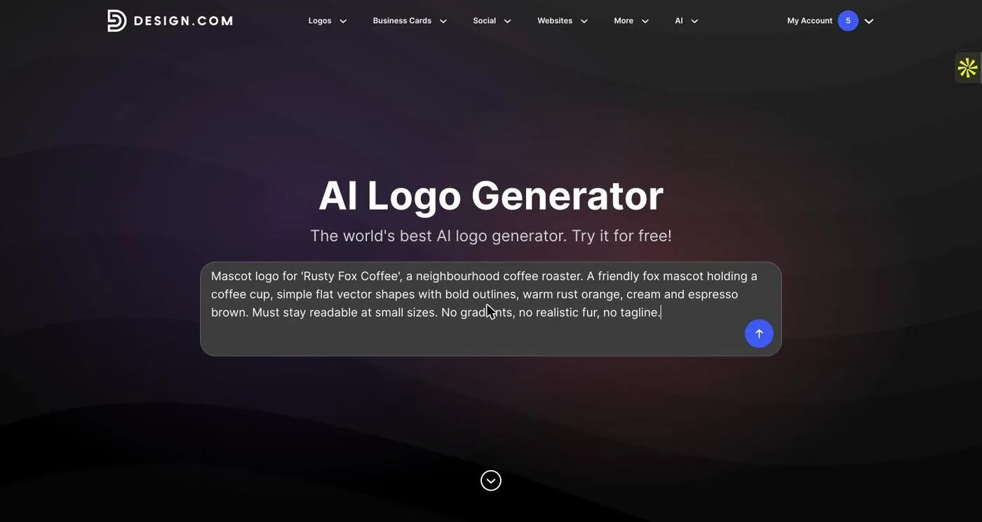
Write a brief that includes the mascot and the exclusions
I entered: “Mascot logo for ‘Rusty Fox Coffee’, a neighbourhood coffee roaster. A friendly fox mascot holding a coffee cup, simple flat vector shapes with bold outlines, warm rust orange, cream and espresso brown. Must stay readable at small sizes. No gradients, no realistic fur, no tagline.” Naming the style (flat, bold outlines) and the exclusions steers the generator away from realistic art.
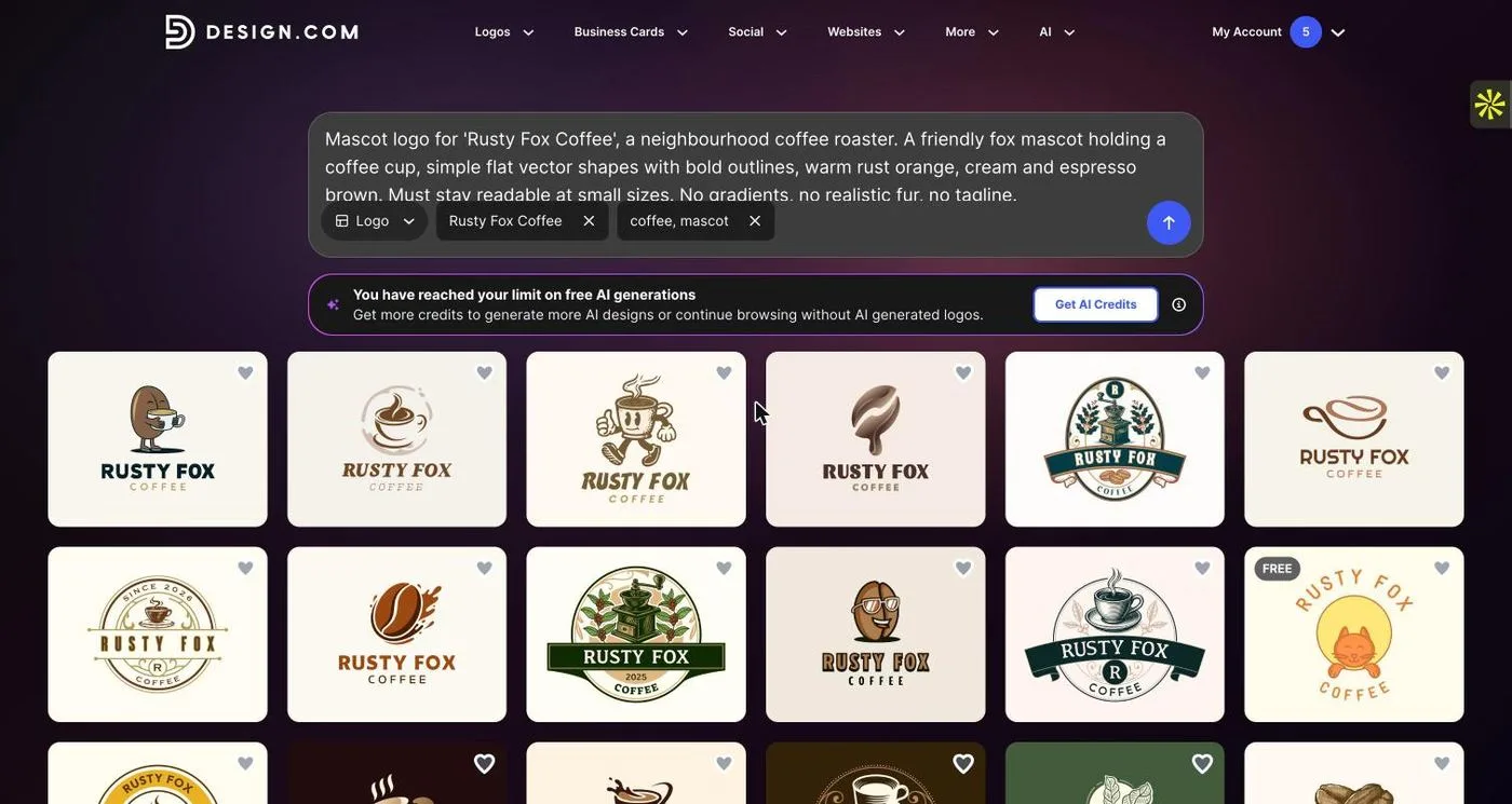
Read the results against the brief
Design.com recognised the name (“Rusty Fox Coffee”) and the keywords (“coffee, mascot”), but because the free AI generations were used up it returned template matches only, with a prompt to buy AI credits. The matches included coffee-bean and cup characters, badges and cups. None of the results I saw was a fox, so the character itself did not follow my brief; the name was the only part that did.
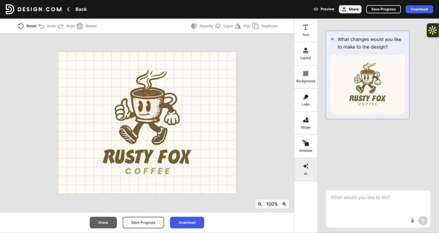
Pick the strongest character, not the strongest colours
I chose the walking coffee-cup character with a retro rubber-hose style. It was the best silhouette in the set: a clear head shape, a thumbs-up pose and a steam curl on top. It is not a fox, so I would treat it as a placeholder character that proves the layout and lettering, and not as the final mascot.
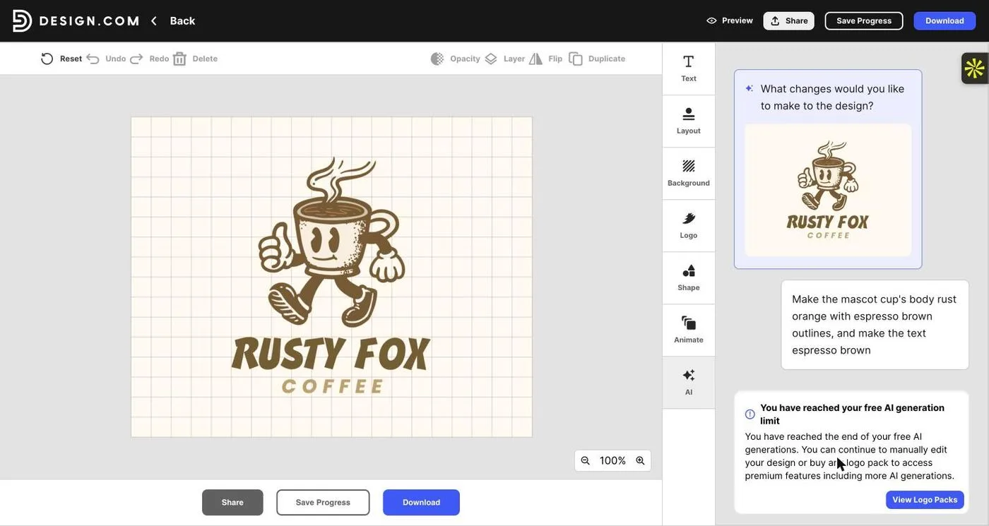
Ask the AI chat to recolour it
I asked the AI chat to make the cup body rust orange with espresso brown outlines and text. It returned the free-limit message: “You have reached the end of your free AI generations. You can continue to manually edit your design or buy a logo pack.” Manual editing remained free.
Recolour by hand with exact hex values
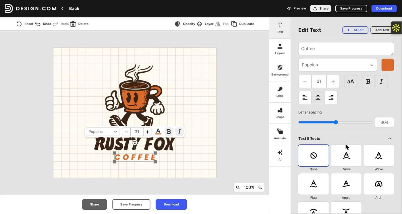
Selecting the character shows its four colours as swatches. I replaced the cream body with rust orange (#D9692B) and the dark brown outlines with espresso (#3A2316), then set the “RUSTY FOX” text to the same espresso and “COFFEE” to rust. Because the character is vector, each colour changes everywhere it appears in one move.
Preview the logo in context
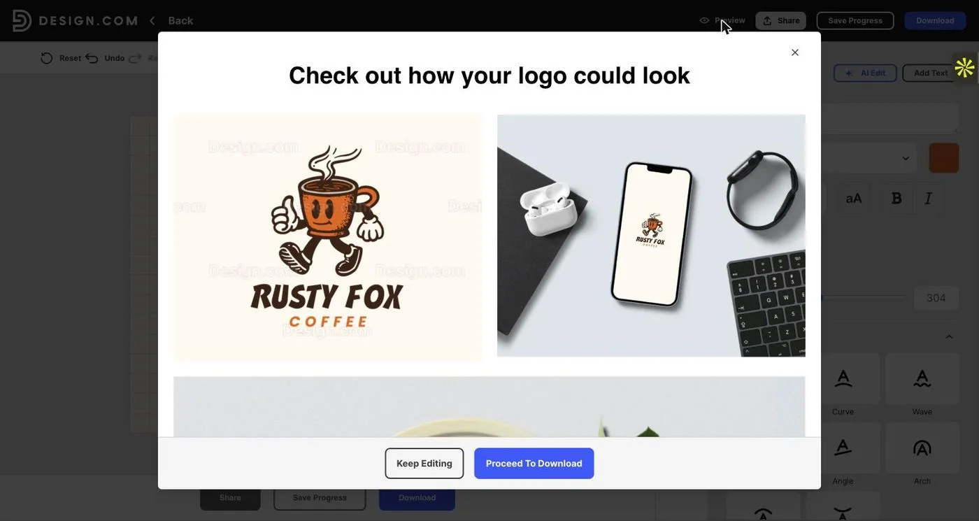
The preview (watermarked until download) shows the recoloured mascot lockup on its own and on mock-ups such as a phone screen. Checking it on a phone is the quickest way to see whether the mascot still reads at small size; here the steam curl and cup outline held up.
Check what you get before paying
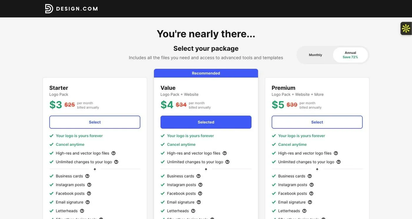
Downloading opens package selection: Starter, Value and Premium, listed at $3, $4 and $5 per month billed annually, each with high-resolution and vector logo files and unlimited changes to the logo. I did not buy; the design stayed in the editor.
What this session shows
The editor is genuinely useful for recolouring and lettering, but the character came from the template library, not from my brief. If you need an original fox, an AI generation (with credits) or a custom illustration is the route; if a stock character is acceptable, remember that other businesses can use the same one. For nine tools tested on the same brief, see our tested AI logo generators comparison.
Method 2
How to design a mascot logo by hand, the way illustrators do
No generator: you draw, simplify and build every shape yourself, so the character is yours alone.
This is how most original mascot logos are made. It takes longer, but it is the only route that gives you a character nobody else has, along with the layered files and poses you will need later. First, the tools designers use.
The tools designers use
Procreate
A drawing app for iPad. Many illustrators sketch mascot thumbnails and rough poses here before building clean vectors elsewhere.
Adobe Illustrator
The industry-standard vector editor. Precise curves, shape-building tools and clean export make it the default for finished mascot artwork.
Figma
A browser-based tool with a free plan and solid vector editing. Good for building simple geometric mascots and showing lockups to clients.
Affinity Designer
A full vector editor that many illustrators use as an alternative to Illustrator, with strong curve and shape tools.
Inkscape
Free, open-source vector software. It can produce a clean, scalable SVG mascot at no cost, which makes it the best free route for a hand-drawn character.
Krita
Free, open-source painting software for sketching and colour exploration. Use it for rough drawings, then trace and rebuild the final character as vectors.
Step by step: designing the Rusty Fox Coffee mascot by hand
Write the personality brief
Rusty Fox Coffee is warm, clever and a little mischievous. Write three adjectives, three uses (a paper cup, a shop window decal, a 40 px social avatar) and an avoid-list: no realistic fur, no gradients, no tiny details. Every later decision is checked against this page.
Collect references, then close them
Gather photographs of foxes and a few mascots you admire. Notice the identifying features of a fox: pointed ears, a white muzzle, a bushy tail with a pale tip. Then close the references. You are drawing an idea of a fox, not copying one.
Sketch twenty silhouettes
Draw small, fast thumbnails in solid black: head only, sitting, walking, holding a cup, peeking over a cup rim. Look for the shape that reads from across a room. For a fox, an upright pose with a curled tail often beats a side-on walk.
Refine one sketch
Redraw the best thumbnail larger. Decide the eye shape, the muzzle, the ear angle and the cup. Keep it flat: no fur detail, no shading. Make the proportions friendly with a large head, short body and generous eyes.
Build the vector from simple shapes
Place the sketch on a locked layer and rebuild it in Illustrator, Affinity, Figma or Inkscape with circles, triangles and a few pen-tool curves. Use one stroke weight (for example 6 pt at artboard size) and rounded corners throughout. Fewer anchor points mean smoother curves and a more consistent character.
Colour it with a locked palette
Use four colours: rust orange (#D9692B) for the fur, cream for the muzzle and cup, espresso (#3A2316) for outlines and lettering, and one soft highlight. Check contrast between rust and cream, and make sure the character still reads in a one-colour espresso version.
Draw the second and third views
Create a head-only version for avatars and favicons, and two expressions, such as a smile and a wink. Keep the construction identical so the set looks like one character. This is the step that turns a drawing into a mascot.
Set the lockup with the name
Choose a typeface that matches the character’s energy, such as a chunky rounded sans. Try horizontal and stacked lockups, and give the mascot clear space equal to the height of a letter. Compare against the quick Design.com template layout from Method 1 to see what a custom character adds.
Test small, reversed and flat
View it at 32 px, 64 px and 200 px. Test it in one colour on white, cream on espresso, and on a photograph. Print it at 30 mm for a cup sleeve. If the eyes disappear or the tail merges with the body, simplify the shape.
Export and document
Export an outlined SVG, a vector PDF, and transparent PNGs of each version. Keep the layered master file. Write a one-page guide with the palette, the minimum size, the clear space and which version to use where.
Open each exported file in a vector editor before treating it as final. A file called SVG can contain an embedded raster image, which will not scale.
Mascot logo design services: when to hire a designer
A mascot is an illustration project as much as a logo project, so the people who do it well are usually illustrators or brand designers with character work in their portfolio. Hiring makes sense when you want an original character, when the mascot will appear in many places, or when it needs to be trademarked.
The main options are a freelance illustrator or brand designer (direct collaboration, good for a focused project), a branding studio (best when naming, positioning and a wider system are also needed), a design marketplace or contest (more options, less depth), and an online mascot maker (fast, but the character comes from a library). If you are comparing providers, our guide to the best logo makers of 2026 covers the online options.
When you evaluate mascot logo design services, ask for:
- Portfolio examples of mascots used at small sizes and in one colour, not only polished mock-ups.
- The deliverables in writing: layered source files, vector exports, poses, expressions and a one-page usage guide.
- A written assignment of copyright and a statement on whether AI tools were used in the artwork.
- The number of revision rounds, and what counts as a new concept.
- An itemised price, because cost depends on poses, expressions and usage rights.
Mascot logo design free: what’s realistic
You can get a mascot logo for little or nothing, but “free” means different things:
- Draw it yourself in free software. Inkscape, Krita and the free plan of Figma cost nothing and have no watermark. The price is your time and drawing skill.
- Customise a template in an online maker. Design and preview are usually free; clean, high-resolution or vector downloads usually cost money. In my session, Design.com offered free manual editing and a watermarked preview, with files behind a $3–$5 a month package.
- Use an AI generator on its free allowance. Allowances are small; in my session the free AI generations were already used up, which meant no AI chat edits.
- Use an openly licensed character. Some assets come with attribution terms, like the Android robot, but a shared character is never exclusive to your brand.
For a side-by-side look at what “free” covered in nine tools, see our free vs paid logo makers guide.
Best logo makers for a mascot logo: how the options compare
If you are comparing AI logo generators, the most useful questions are: can I keep editing after the first result, does it respect my avoid-list, what files can I download, and what does it cost? These are the tools I would shortlist. I tested each of the first six hands-on in our AI logo generator comparison; the mascot walkthrough above was run in Design.com only.
| Tool | What it is good for | What to watch |
|---|---|---|
 Design.com | Prompt box plus a big template library, with an editor where characters stay editable (recolour, retext, reposition). | Free AI generations ran out quickly in my sessions; files come with paid packages. |
 BrandCrowd | Large grid of generated and template designs, filterable by style. | Downloads are paid; check the licence for the character artwork. |
 Kittl | Design-led platform with strong lettering tools and an AI agent for one-detail edits. | Check export format and plan limits for vector files. |
 Ideogram | AI image model known for accurate text, useful for exploring character styles. | Output is raster; plan to vectorize or redraw the final mascot. |
 Canva | Quick concepts inside an editor many teams already use. | SVG and transparent backgrounds sit behind Pro. |
 Namecheap Logo Maker | Guided quiz-style maker, simple starting point. | Needs an account to download; icon-based rather than character-led. |
The best AI logo generator for a mascot is the one that lets you control the character after the first result and shows you real files before you pay. The best free logo maker is the one whose free tier gives you a clean vector file; very few do. For a startup that wants something cheap but professional, I would start with an online maker or free vector software for the first version and spend the budget on a designer for the final redraw.
Design.com
AI logo generator, templates and editor in one place. Paid packages include vector files and unlimited logo changes.
BrandCrowd
Generates a large grid of designs from a description and lets you filter by style, then edit in a familiar editor.
Kittl
Design platform with strong typography tools and an AI agent for targeted edits.
Ideogram
Good at readable text in AI images; use it to explore mascot styles, then rebuild as vectors.
Canva
Quick AI concepts inside an editor you may already use for marketing material.
Namecheap Logo Maker
A guided maker where you choose fonts, colours and icons rather than writing a prompt.
Free vs. paid, commercial use and trademark
A mascot has more legal surface area than a wordmark because it is an illustration. Before you launch, check four things.
Who owns the artwork? If a designer drew it, get a written copyright assignment. If a platform provided it, read the licence for the specific character, shape or font you used.
Is it exclusive? Commercial-use permission does not mean other businesses cannot use the same template or a near-identical one. Run a reverse-image search and a name search before you commit.
Is it a true vector? Paid plans often add vector files. Confirm you receive an SVG or EPS and inspect it in a vector editor.
Can it be trademarked? Commercial use is not the same as registrability. Check the artwork and name with a qualified professional before a significant launch. I am a brand designer, not a lawyer, so treat this as a checklist and not legal advice.
For a startup on a tight budget, my own priority order would be a strong silhouette, a small palette, three or four versions of the character and clear usage rules. Spend where mistakes are hard to correct later: originality, the redraw of the final character and the production files.
Mascot logo FAQs
What is a mascot logo?
A mascot logo uses a character, such as an animal, person, object or creature, as the main identifying symbol of a brand, team or product. The character carries personality and recognition, and it often appears with the brand name as a lockup.
How do you design a mascot logo?
Start with the brand personality, sketch many silhouettes, simplify the strongest one into bold vector shapes, limit the palette, design two or three expressions or poses, then pair the mascot with the name and test it at small sizes and in one colour. You can do this by hand in a vector editor, or start from an AI logo maker and refine the result.
What is the difference between a mascot logo and logo and mascot design?
A mascot logo is the character used as the logo. Logo and mascot design usually means a system: a primary logo (often a wordmark or emblem) plus a separate mascot character used in campaigns, packaging and social media. Many brands use the mascot as the logo in some places and as a supporting character in others.
Can I create a mascot logo for free?
Yes, with limits. You can draw one yourself in free software such as Inkscape, Krita or the free tier of Figma, or customise a template in an online logo maker. Free online makers usually let you design and preview for free but charge for clean, high-resolution or vector downloads, so check the download stage before you invest time.
What is the best AI logo generator for a mascot logo?
It depends on what you need after the first result. In our hands-on tests of nine AI logo generators, the useful differences were spelling accuracy, how well each tool kept to an avoid-list, whether a follow-up edit changed only one detail, and what files were available without paying. For mascots, look for a tool that keeps the character editable after generation. See our tested comparison of AI logo generators for the full results.
What is the best free AI logo generator?
Most AI logo generators are free to try but limit generations and charge for downloads. In my sessions, Design.com ran out of free AI generations quickly but still offered free manual editing; Ideogram and Wixel worked on small credit allowances. Treat any “free” claim as free previews until you have seen the export screen.
Which logo maker is best for small businesses on a budget?
A small business that wants something cheap but professional can start with an online logo maker such as Design.com or BrandCrowd, which show paid packages from about $3 a month billed annually at checkout, or use free vector software and invest the budget in a designer for the final polish. Compare file formats, commercial-use terms and total cost before choosing.
Are there logo makers with no watermark and no sign-up?
Rarely for downloads. Previews are often free and unwatermarked on screen, but the exported file usually requires an account or payment. In my tests Design.com previews carried a watermark until download, Namecheap needed an account to download, and Dreamina charged to remove its watermark. Free vector software has no watermark or sign-up at all.
Is a logo from a logo maker free for commercial use?
Commercial-use permission differs by tool and by asset. Check the licence for the specific fonts, shapes and illustrations you used, and remember that permission to use a logo commercially does not make it exclusive or guarantee it can be trademarked.
What software do designers use to draw mascot logos?
Most sketch first on paper or in Procreate, then build the final vector in Adobe Illustrator, Affinity Designer, Figma or Inkscape so the mascot scales cleanly.
How much do mascot logo design services cost?
Prices vary widely by designer, usage rights and how many poses, expressions and files are included, so request itemised quotes. Ask whether you receive the layered source files and a written copyright assignment, not just PNGs.
Should my mascot logo have a body or just a head?
Head-and-shoulders or head-only mascots are usually easier to read at small sizes, such as an app icon or social avatar. Full-body characters suit signage, packaging and campaigns. Many brands design both and use each where it fits.
Can I use AI-generated mascot art as my logo?
You can, but check what you actually received. A raster image is not a production logo, AI output can resemble existing characters, and the legal status of AI-generated artwork varies by jurisdiction. Run name and image searches, keep records of your prompts and edits, and consider having a designer redraw the final character.
Before you sign off on a mascot logo
Run this list on the final artwork, not on a presentation mock-up:
- The silhouette filled in solid black is still recognisable.
- It reads at 32 px, at 200 px and on a large poster.
- It works in one colour, reversed on a dark background and on a photo.
- The personality matches the three adjectives in the brief.
- The palette has no more than four colours with exact codes recorded.
- There is a head-only version, at least two expressions and a stacked lockup.
- The name is spelled correctly in every lockup and has enough space around the character.
- The files include a true vector (SVG or EPS), a PDF and transparent PNGs.
- Ownership, licences and similar-character searches are documented.
If the answer is yes to all of them, you have a mascot logo. If a few are a no, the fastest fix is almost always the same: simplify the shape.